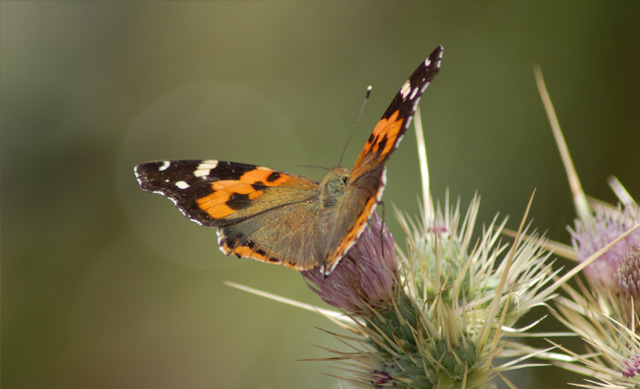
its hard to get what you want when you're outside background and color wise and i think this photo can show it well ; the colors are very washed out you could have upped the saturation so that we can see that the complimentary colros are not on the butterfly but rather the flora beneeth (pink - red and green)
the butterfly really makes it like the complimentary colors are accessory in order to fit the challenge whereas they ought to be the main theme or focus of your photo. 2.
I feel that the colours are a little dull. I'm not sure, are you going for orange and purple here? I do like the photo, but just not for this challenge.
Good capture. My first thought was that you could have cropped a bit more to the right, but it would probably throw the pic out of balance. A tiny bit more saturation might have worked to make the colours pop a bit more.
2 - Fairly nice capture, but I'm seeing orange primarily followed by green then some 'purple'. Closest 'scheme' I can decipher at a stretch is red/green - just don't think this meets the Challenge strongly enough.






 Add photograph to your favorites
 Add photographer to your favorites


