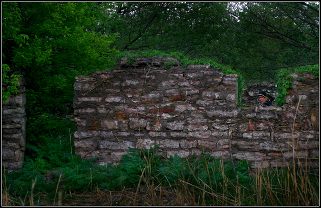
From reading some of your comments, it seem a little dark and from your histogram it really did show many white pixels except up in the sky area. A quick tip in levels if you hold down the ( option on a Mac or alt on a pc ) and left click the triangles below the histogram and slide them it will show you black pixels which are on the left and white pixels to the right triangle. I do not mess with the center I use curves for this. Most of the time I just slide them until I barely get white or black pixels. I have some examples for you later, whether you need them or not its totally up to you. I also darken behind the block wall it seemed to push it forward adding a little depth.
Now that your subject stands out more, as I looked over your shot, I notice that the tree branches might have outlined this house or building at one time. So now there are more diagonal features to it. Those of the trees and on the block wall and the man carrying the axe and the subject is close to a third, but I don't even think with a good crop you could get him there without loosing a lot of the picture. This just my opinion and you can see my changes here and please let me know if you don't want my version of your image online, and I'll take it down.
You have yourself a wonderful day and good luck in future challenges.
Mark Thomas Kelsay
I had to search at first to find the window... then ahhhh there it is! Seems rather dark, maybe you meant to do it that way for the mood you are trying to create... it needs something to draw your eye to the subject...
A bit too dark to really see the picture well. Almost like a Where's Waldo - had you not titled it as you did, I'd not have known a person was there somewhere.
Good idea here, but it took me too long to find him. The brightness of the greenery mixed with the darkness of the stone and shadows are too overwhelming to really take notice to the main subject for me.
I gave a 5, only because it takes some looking to find the guy. Good color and focus. I can see he is carrying an axe but he is so small in the pic that the impact is lost.
Beautiful photo, but without your title I would not have noticed the man in the square at all. A closer crop to make the lumberjack stand out more would have given you a point or two more from me. Good luck
Bumping this one little because I missed the "window framed" part to this the first time around. But I think you may of sold yourself short of the real potential of this photo by going with such a wide crop.
Wonderful wall, and greenery, but I can't say I understand the title, and the subject is a little hard to pinpoint. The composition between the wall and plant life is good though. hehe.





 Add photograph to your favorites
 Add photographer to your favorites

 Photographer found comment helpful.


