| Author | Thread |
|
|
12/08/2012 07:16:16 AM |
|
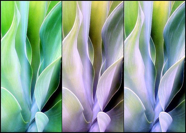
a wonderful triptych - your passion for these shines through |
|
 Photographer found comment helpful. Photographer found comment helpful. |
|
|
05/16/2006 02:28:30 AM |
|
real nice triptych....once again, these plants and your photographs give off a nice artistic painting feel. |
|
| Photographer found comment helpful. |
|
|
05/07/2006 03:09:25 PM |
|
Your works with this plant are just amazing. I love them all! |
|
| Photographer found comment helpful. |
|
|
04/29/2006 02:40:57 PM |
|
Technically, this is a "triptych" of 3 distinct versions of the same image, not a "merge". It is handsome, and it is good to see you experimenting, but I much prefer the original ojn its own. However, I'd expect that if theis were in a gallery as a large print, many might prefer it to the single-frame shot simply because it so obviously injects an element of "art" into what many might see as "just" a photograph. |
|
| Photographer found comment helpful. |
|
|
04/28/2006 09:03:10 PM |
|
The sense of abstraction here is clear and concise. Might I suggest you do a triptych instead of this one? That would really make it stand out. Use the full 640 pixels and with black borders. I think this will really sing ;) |
|
| Photographer found comment helpful. |
|
|
04/24/2006 08:32:27 AM |
|
Woow this is a nice one! I love all your agaves very much! All the beautiful colors! |
|
| Photographer found comment helpful. |
|
|
04/23/2006 12:44:12 PM |
PRETTY PRETTY! I love the shape of the leaves. The variation of color to create a tryptic really is artful!
How are you??? |
|
| Photographer found comment helpful. |
|
|
04/23/2006 11:24:11 AM |
This is an awesome study. I would try changing the rightmost tones just a touch more to seperate them more like the left two...
TC
Edit to add: Or perhaps put the right one in the middle...
Message edited by author 2006-04-23 11:37:21. |
|
| Photographer found comment helpful. |
|
|
04/21/2006 07:56:57 AM |
|
Images are reminiscent of Georgia O'Keefe in terms of hue and tone; repetition brings to mind Andy Warhol. Presented with this sequence, it would be hard to say it was derived from a photo. |
|
| Photographer found comment helpful. |
Home -
Challenges -
Community -
League -
Photos -
Cameras -
Lenses -
Learn -
Help -
Terms of Use -
Privacy -
Top ^
DPChallenge, and website content and design, Copyright © 2001-2026 Challenging Technologies, LLC.
All digital photo copyrights belong to the photographers and may not be used without permission.
Current Server Time: 06/27/2026 10:01:25 AM EDT.