| Author | Thread |
Comments Made During the Challenge  |
|
|
04/23/2006 03:48:30 AM |
|
Even though I like the composition in general, it's just too out of focus. |
|
|
|
04/22/2006 02:35:12 PM |
|
I think this would work better if the person on the wall were not centered. Good focus and colors. |
|
|
|
04/22/2006 07:49:04 AM |
|
|
|
04/21/2006 03:00:08 PM |
|
I Don't see much association to old in the picture itself (only via its title). |
|
|
|
04/21/2006 10:40:28 AM |
|
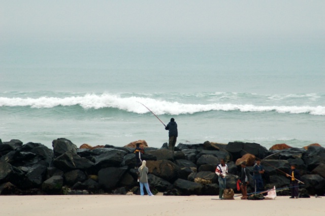
Too many horizontal lines and not really a clear focus. I understand, fog, haze, etc. I do like the blak rocks :) |
|
|
|
04/19/2006 02:26:44 AM |
|
i think you need to get right in there and make something the center of attention. |
|
Home -
Challenges -
Community -
League -
Photos -
Cameras -
Lenses -
Learn -
Help -
Terms of Use -
Privacy -
Top ^
DPChallenge, and website content and design, Copyright © 2001-2026 Challenging Technologies, LLC.
All digital photo copyrights belong to the photographers and may not be used without permission.
Current Server Time: 06/29/2026 08:55:48 AM EDT.