*brightness/contrast
*crop
*smudge tool
*selective dodge and burn
*rotated slightly to level
*push tool on small piece of hair
*full photo saturation
*sharpened twice
*grunge brush to bring out a bit more green to the eyes
*resize
Statistics
Place: 151 out of 199 Avg (all users): 5.1313 Avg (commenters): 4.7500 Avg (participants): 4.8257 Avg (non-participants): 5.3533 Views since voting: 1190 Views during voting: 383 Votes: 259 Comments: 16 Favorites: 0
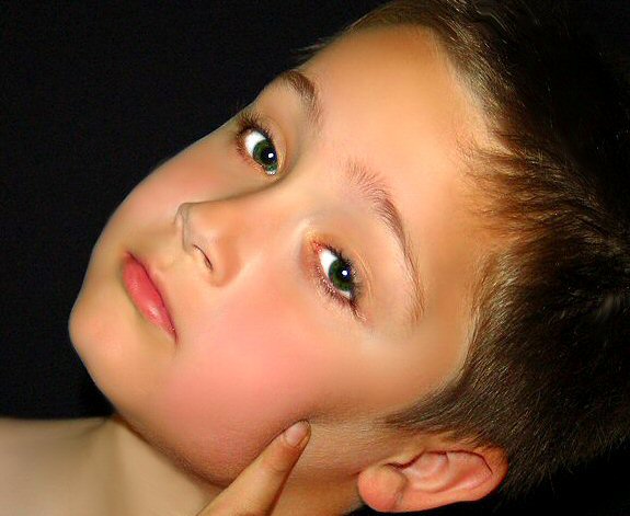
Just to clarify, a lot has been said about the processing of this image. Little was actually done. It took me all of 10 minutes. The only coloring added was to the green of his eyes to accent his natural color. The rest is all natural coloring using only a desk lamp, other than brightness/contast, yadda yadda, the basics. The processing to the face was actually minimal. A few distractions removed. His face is really rather smooth and almost angelic, and that is why I used him. No neat image was used, no. The finger I left in because for me it added a bit of interest - a bit of his personality. I liked the dimple it made in the cheek. He is very blushed because he just got done playing real hard before this pic was taken.
Thanks to those that liked it along with me!! I see quite a few 5's and 6's and that is exactly what I thought I would find at challenge end. I am very happy with those and I am thrilled with the scores above that :) For those that scored it lower, I understand your reasoning, and respect that. This was just a shot I almost pulled, but left it in simply because I loved it. The placement of it never really mattered.
This has a lot of potential...the pose and angle are interesting and the contrast and color are great. I do find the finger to be very distracting. I also wish his head were rotated toward the camera a bit more (same angle, just a bit more forward). The skin looks a bit unnatural, like too much noise reduction, and the whites of the eyes are a bit too white. He just appears less natural and more airbrushed overall. That being said, it's still a good image for the challenge. If I could vote, I'd give it a 7. Take care! :)
Some pretty weak processing artifacts here, especially along the cheekline against the black. The noise in your shadows and some midtones, coupled with the unnatural smoothness of parts of the boy's face, also give this photo a very unrealistic feel. I'm also not feeling the pose. Too manufactured. It reminds me of beauty pageant mock-ups or glamour shots. Entirely inappropriate for child portraitures IMO. Lastly, it lacks the "studio" feel, as it's too tightly cropped, and could have been taken anywhere. It's easy to black out a background by lighting your subject brightly. Not the greatest effort, but I hope some of this helps for next time.
Great eye contact and 'model stare' and an adorable little boy. I think it would have been better with more room below him, showing a little more of his shoulders. The one finger looks a little disembodied without seeing more of his hand. Very nice lighting.





 Add photograph to your favorites
 Add photographer to your favorites


 Photographer found comment helpful.


