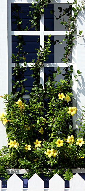
I like the tall format and the way the vines interrupt the edges so the right angles have their own identity instead of being lost in the stronger concept of squares. The white walls and pickets may be a bit bright, but toning them down would either reduce contrast or shadow details, both of which are good, so you probably made the right choice.
This is just really sharp and pretty and summery. I wish I could think of a more technical comment! I do like the right angles of the tops of the pickets at the bottom, pointing the eye upward.
Super idea. The bit of fence at bottom is a wonderful touch! Lighting is a bit harsh. Go back when it's overcast or when it is in shadow, and you'll see magic here.
Good right angle. The only thing I might have done different is time of day photo was taken. Try early morning or evening. Better light! Overall a nice shot.





 Add photograph to your favorites
 Add photographer to your favorites


 Photographer found comment helpful.


