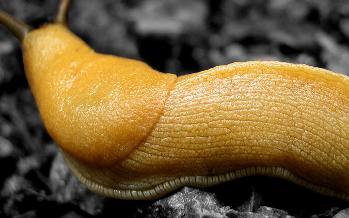
What a beautiful photograph. I like the variegated textures of the three main areas of the slug: it's head, it's body, and the lining around it's foot. This is displayed perfectly against the further texture found in the background, which appears desaturated, causing the slug to pop off the image expertly. Well done.
Since the subject here is the slug's "skin", I think the depth of field is good, even though the antennae are out of focus, which might detract for some. Light for me is excellent, with the right amount of highlights to give us a sense of the texture of the slug, and the correct exposure for the background that allows for that wonderful pop. Composition is good, with the main subject virtually filling the frame, and almost giving a feeling of being "anchored" to the frame by the two protruding elements at upper left.
There is evidence, I think, of post-processing around the antennae. I may be seeing haloing, as well as a very slight disparity in tone that looks like the slug is actually a selection area. Nit-picky stuff I notice on close inspection, which is ultimately a good thing, because one really wants to look around this photograph for a long time. This is a great image, congratulations.
ewwwww hehe. i think you should have focused on his head because the way it is now, welllll....i know what it is but it cpi;d be seen as a little nebulous.






 Add photograph to your favorites
 Add photographer to your favorites

 Photographer found comment helpful.


