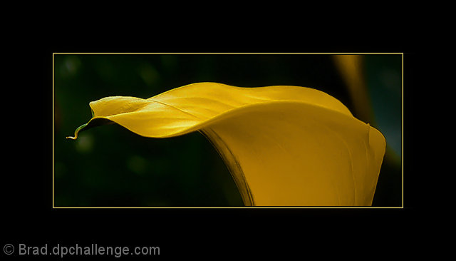
There might be more pixels in the border than in the picture itself = P
It does add a nice emphasis though, and I'm sure would look nice framed. That said, for a photo challenge, I think the border is a bit much. The exposure, bokeh and composition of the flower are very nice though.
I love the idea behind this. I adore the curves and how well you highlighted them and brought them to attention. The lighting is very good (I wonder if more backlight might've brought those curves out even more? That's a legitimate question not a backhanded suggestion btw! :D ) I think the border is a little big, but it does help reinforce that nice horizontal line and bring the subject into higher prominence. The focus is good but there are areas where its soft along the flowers lip line. Finally I think the mottled background is great, but I wish it was uniformly green mottling rather than with that yellow streak and bit of light blue in the back. The various shades of mottled green make an excellent background. 8.
Lovely subject placement and crop, but the background is distracting. It's ok on the left hand side, but the goldis-brown strak on the right just sticks out like a sore thumb.
First thumbnail that came up in the voting for me and I think it's gorgeous. I usually hate fat borders, but I think it works well here. I'm sure you are getting lots of comments about it though. DPC loves to hate borders. I have first hand experience of that. ;) 8
So it looks to me that you might have a wonderful photo here. I really like the lines and the curly-q at the end of the flower. While I believe that as a print, the strong and oversized border would be pleasant on the wall to see, here, it is a negative for me because it takes away from being able to enjoy what I think might be a really nice photo. JMO.







 Add photograph to your favorites
 Add photographer to your favorites

 Photographer found comment helpful.


