Greetings from the Critique Club!
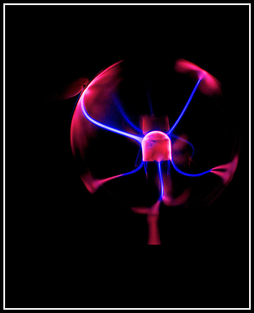
Your photo is a nice example both of a relatively low-key image, and an image in which negative space is used to good effect. One's eye is immediately drawn to the centre of the ball, and from there outward along the blue lines and to the edges. A nice composition.
In my opinion, though the negative space works well, it is possible that there is simply too much negative space. I think a tighter crop may have improved the overall composition. The bottom is particularly heavy; the effect there causes the ball to "float" in an unnatural way. Were the subject cropped at the edge of the frame, similar to the original, the image may have had a strong impact. For this reason, the rather heavy border also somewhat detracts, drawing the eye away from the main subject, which is much darker than the border. You may have also wanted to wait for a more interesting "pulse" from the orb, though the limitations of the hardware may be an obvious contributing factor.
Overall, a nice effort, and an interesting photo. Congrats!
Hope this helps,
Louis |