| Author | Thread |
|
|
03/22/2006 11:50:00 AM |
"P" Stands for Prison, It's not a parking sign, it's a Stop Sign. Sorry if the image wasn't simple enough and required anyone to think. I've never known a prison to be attractive. There is a gun tower, moat and razor wire in the picture. Maybe if I put some boobies in the picture next time, I'll get higher votes.
Yes, I am a sore loser.
Steve
IrritationStation.com |
|
Comments Made During the Challenge  |
|
|
03/21/2006 10:57:38 PM |
|
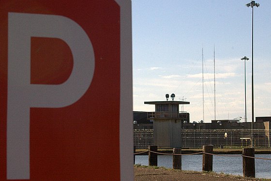
I just don't get the huge "P" on the left HALF of the pic. I think there will be more than a few that feel this pic DNMC. I am not one of them. Good luck in the challenge! |
|
|
|
03/19/2006 09:36:18 AM |
|
I am not sure why the parking sign is so prominent in this shot - parking at jail? Also the water softens and makes this place more attractive, instead of fearsome... maybe black and white to take away all color and life from this shot would have had more of an impact, and a tighter crop on so that there is no down time trying to figure out what this shot is of. |
|
|
|
03/18/2006 10:53:09 PM |
|
I don't understand the role of the sign in this iamge. |
|
|
|
03/18/2006 12:55:57 PM |
|
Ooooh. . .great take on the challenge. |
|
|
|
03/16/2006 01:34:08 AM |
|
|
|
03/15/2006 03:21:55 PM |
|
Sorry, but this doesn't meet the theme for me. Without the title there's nothing about it that says "education" to me. Composition and exposure aren't bad though. |
|
|
|
03/15/2006 02:49:43 PM |
|
Interesting idea. Cropped stop sign cuts the composition in two. Would be better if you backed up to avoid this, and the more obvious stop sign would help many other viewers "get it." |
|
Home -
Challenges -
Community -
League -
Photos -
Cameras -
Lenses -
Learn -
Help -
Terms of Use -
Privacy -
Top ^
DPChallenge, and website content and design, Copyright © 2001-2026 Challenging Technologies, LLC.
All digital photo copyrights belong to the photographers and may not be used without permission.
Current Server Time: 06/28/2026 05:35:32 PM EDT.