| Author | Thread |
Comments Made During the Challenge  |
|
|
07/07/2002 10:12:00 AM |
|
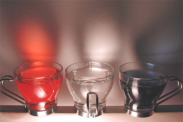
Creative and timely shot. Well composed and exposed. |
|
|
|
07/05/2002 09:30:00 PM |
|
|
|
07/05/2002 05:28:00 AM |
|
Nice clean shot. Would have liked it better if the shadows were symetric too though. |
|
|
|
07/04/2002 09:37:00 PM |
|
would make a good abstract poster |
|
|
|
07/03/2002 10:55:00 PM |
|
I love the color and smoothness of this shot.. the lighting is great :) the only thing I think would have improved it somewhat would have been to point the light at the center of the middle glass to cast the shadows evenly across the image :) = 8 - jmsetzler |
|
|
|
07/02/2002 08:59:00 PM |
|
Good job on this photo, it has nice lighting, composition, and clarity. I think (subjective opinion) that this could be improved with a bit more color saturation, flatter lighting to reduce reflections, and turning the handles all one way for a repeating pattern. It has symmetry, but I think a repeating pattern would work better. Also, as it is the cropping is too tight on the left. |
|
|
|
07/02/2002 08:26:00 PM |
|
|
|
07/02/2002 03:44:00 PM |
|
creative 8 interesting 6 focus 8 fraoming 5 = 7 |
|
|
|
07/02/2002 03:41:00 PM |
|
I wish the camera was lower and looking through the cups in this one instead of just catching the reflection of light on the wall. Nice concept though = 6 |
|
|
|
07/02/2002 03:30:00 PM |
|
Very nice, itsy bitsy nit: I don't like the reflections off the glasses, don't really have a good reason why, I guess as a distraction. Good focus, compositon, and framing. Photo 8 Transparency 7 total 8 swash |
|
|
|
07/02/2002 02:10:00 PM |
|
|
|
07/02/2002 11:11:00 AM |
|
|
|
07/02/2002 10:54:00 AM |
|
hmmm. I really like the cups and colored contents. The blurriness of the reflections loses it for me though. I don't know how you could have taken this without being reflected in the glass, but that would have helped too. Maybe if you had put your light source in front of you (not sure). Good idea...would be great with some tweaking. |
|
|
|
07/02/2002 12:27:00 AM |
|
Very nice photo. Well composed, well staged, well photographed. I'm not sure it appeals to me as a concept, but I can appreciate its quality. |
|
|
|
07/01/2002 08:29:00 PM |
|
i really like the picture, but i can't really see through the coloured liquids. it seems like more of a reflection (which is perfectly alright, this comp is about your impression of the challenge theme). |
|
|
|
07/01/2002 06:59:00 PM |
|
Very nice shot, well done. Kee |
|
|
|
07/01/2002 06:36:00 PM |
|
Well executed - but rather uninteresting. Sorry, it just doesn't appeal to me... |
|
|
|
07/01/2002 06:25:00 PM |
|
Your blue looks to much like a gray hue. |
|
|
|
07/01/2002 06:15:00 PM |
|
Wish you hadn't clipped the red cups handle. |
|
|
|
07/01/2002 12:57:00 PM |
|
Slightly washed ,needs just a touch more color. |
|
|
|
07/01/2002 12:36:00 PM |
|
|
|
07/01/2002 09:28:00 AM |
|
Nice use of light and shadows. |
|
|
|
07/01/2002 02:16:00 AM |
|
GREAT photo. The red and blue could be a little deeper. The only *flaw* I see is the handle on the left is cut off. Nice Job ! |
|
Home -
Challenges -
Community -
League -
Photos -
Cameras -
Lenses -
Learn -
Help -
Terms of Use -
Privacy -
Top ^
DPChallenge, and website content and design, Copyright © 2001-2026 Challenging Technologies, LLC.
All digital photo copyrights belong to the photographers and may not be used without permission.
Current Server Time: 06/28/2026 01:32:27 PM EDT.