| Author | Thread |
|
|
03/02/2006 03:23:22 PM |
|
Thanks for all the responses. I will take all the comments and build from them. Jae |
|
|
|
03/02/2006 03:26:31 AM |
* Greetings from the Critique Club *
First Impression:
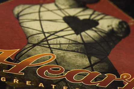
It's a nice shot, but it lacks any real 'punch'. I feel that the shot has been cropped a little too close to have enough impact.
Lighting:
Seems ok, although it is quite hard to tell. There are no patches that look odd, so in that respect it is adequate.
Focus/DoF:
Good creative use of DoF - although I would prefer to see the text more in focus. It seems to me that the focus is sitting right at the top of the 'H' and it is a little hard on the eyes.
Colour:
Again, there is nothing here that jumps out as either good or bad. There seems to be a good balance on the whole, and it looks to be an accurate representation of the real object.
Composition:
I notice there are some comments regarding the black corners, and suggestions they be cropped out. Looking at the photo, I'm not sure that's possible, but I would have preferred to see the writing a little higher in the photo. This could also have helped with your focus too.
Subject/Meeting the Challenge:
It feels 80's to me. I note there are also comments regarding the potential representation of artwork - I *think* you are in the clear with this due to the focus and composition, but it is a grey area, in my opinion.
Final thoughts: I would suggest, that when you ask to have an image commented on by the Critique Club, you include your camera settings and give us a little hint in the Photographers Comments column of what your thoughts/intentions were when you took the photo.
Mark |
|
Comments Made During the Challenge  |
|
|
02/24/2006 12:15:47 AM |
|
Nice image, lighting looks okay and the focus seems to be good, but I can't tell where the photographer's creativity came in here. To me it looks like a picture of an album cover (which I could easily be wrong about but may be against the rules?) so in general its a nice image but I don't see much soul to it and it doesn't really draw me in. I gave a 4 |
|
|
|
02/22/2006 11:25:54 AM |
|
|
|
02/21/2006 10:45:56 PM |
|
The very first song I danced to with my now husband/then boyfriend 'Alone' by Heart. :-) |
|
|
|
02/21/2006 09:16:49 AM |
|
For me, this borders on the edge of the Literal Artwork rules... there's a bit of creativity with the dof, but it's mostly just a shot of an album cover. Perhaps adding the cassette/record that came with it in a creative arrangement? |
|
|
|
02/21/2006 04:54:36 AM |
|
Would have cropped the black areas at the corners out, ok pic though |
|
|
|
02/20/2006 11:59:42 AM |
|
This is just a close-up of someone else's art. You should have included some other objects and made it a still-life. |
|
|
|
02/20/2006 11:01:35 AM |
|
This is a great composition. The DOF is awsome. |
|
|
|
02/20/2006 03:17:31 AM |
|
The iamge loses impact through lack of size. |
|
|
|
02/20/2006 01:52:26 AM |
|
not sure this will qualify...sorry |
|
|
|
02/20/2006 12:40:05 AM |
|
Isn't taking a picture of a picture against challenge rules? I will still vote as if it isn't: dull color but a good use of DOF. - 4 |
|
Home -
Challenges -
Community -
League -
Photos -
Cameras -
Lenses -
Learn -
Help -
Terms of Use -
Privacy -
Top ^
DPChallenge, and website content and design, Copyright © 2001-2026 Challenging Technologies, LLC.
All digital photo copyrights belong to the photographers and may not be used without permission.
Current Server Time: 06/29/2026 09:24:29 AM EDT.