Per your request, here is your in depth critique from the Critique Club.
Without any photographer's comments, it's difficult to tell what your intentions were for this photo, so my critique can be based solely on peronal opinion since I do not know what your intentions were.
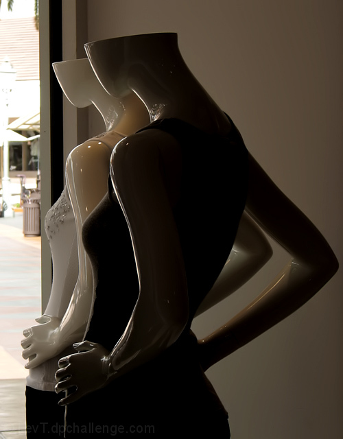
The first thing I noticed was the left side of the photo. Like other commenters, I find it quite distracting and 'ugly' amongst the beauty of the subject.
Since we really can't see much of the fashion that is happening in this photo, I think that it's a stretch for the fashion category for me, but doesn't totally miss the challenge, since it is representative of fashion.
Focus appears ok, lighting is dark though, so hard to tell. There really isn't much to look at. The subjects are dark, and the only really clear part is the outside, which completely lacks interest for me.
The manequins are neat, I like the look and style of them, just wish they were possibly in a different setting somehow. I know, it's not like you can ask the store owner to move them so you can take pics, but non the less, the background hurts an otherwise alright photo.
~Heather~
I really think a different angle on this shot would have served better. The garbage cans outside and the other store fronts or buildings detract from this shot. Maybe a shallower DOF?
For me, had I not been able to see the outside street, I would like this better. I do like the dark mannequin against the light one, and the curves of the bent arms makes for some nice negative space shapes.









 Add photograph to your favorites
 Add photographer to your favorites

 Photographer found comment helpful.


