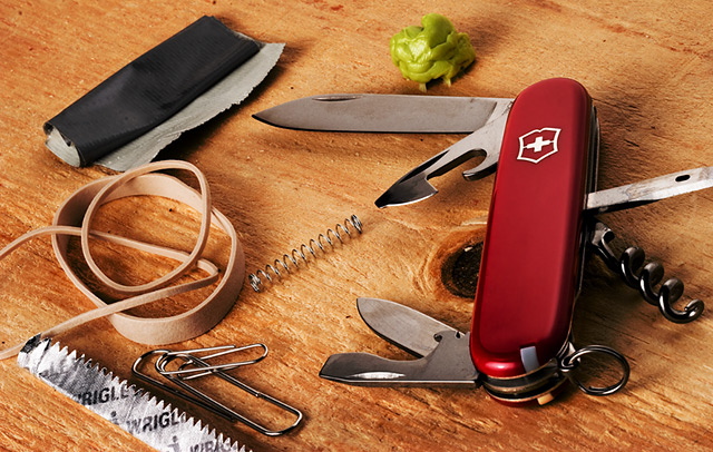
This was about all MacGyver needed to get himself out of any situation. His trusty swiss army knife, chewing gum, ball-point pen spring, duct tape, paperclips & rubber bands.
Statistics
Place: 68 out of 101 Avg (all users): 5.1893 Avg (commenters): 7.0000 Avg (participants): 5.0000 Avg (non-participants): 5.2473 Views since voting: 1284 Views during voting: 358 Votes: 243 Comments: 12 Favorites: 0
NB: all of your comments on this image are from people who know what your reference is. I'd be surprised if many of us Europeans, or of the far east brigade, let alone the Icelanders have the first clue. I have to approach this simply as an image, without knowing the refernces ...
... and as such, it's just too damn busy, I think. Too much stuff, and in a not particularly pleasant arrangement. Almost always, certainly in terms of dpc and this kind of still life shot, the old adage 'less is more' is absolutely true. I'm sure there are reasons for including everything here - but the chewing gum looks likema brussels sprout, half the objects are cropped slightly by the frame (why? what does that communicate?), and the duct tape could almost be any old piece of paper. I'd have tried to reduce the number of objects - there isn't a rule, but I'd want no more than three, and then work on the lighting and the arrangement of those objects. Use the shapes of the rubberbands to make distorted circles that could lead the eye to the other items, but make them have some reference to one another, make the shapes help the composition ... have a good look at all the various still lifes around this site, and see how the successful ones work.
And while you're there, I'd have a good look at the lighting of them too. There's no actual problem here, as such - everything is nicely lit, focussed, there is detail, texture and so on ... it's just a bit bland, isn't it? I'd want to produce a bit more shadow - like the way the shaping of that thicker rubber band is defined by the light, use that across everything in this shot, to really give a sense of shape to the objects, and to allow you to lead your viewer's eye through your composition.
That's all reflected in this score, I think. Whilst those who 'got it' will have scored you one way, the rest - the majority - will have seen a pretty average still life and have moved on pretty quickly. In short too much information here, and not enough organisation of that information. And never forget that this comes from someone who loathes most of the most-favourited photographs on this site, and so should be read wioth the understanding that my suggestions are not guaranteed crowd-pleasers - although i've managed a couple of popular still lifes in my time ;-)
Yep, looks like most of the key ingredients are there. ;^) The kids are now MacGyver fans since we've rented the TV series on DVD from NetFlix. Did you see him in the SuperBowl ad for MasterCard?
As for the photo...it works well on the wood as a background. I like that you intentionally left parts of some components outside the frame of the image. Had you tried to fit it all in some impact would have been lost. The title is key here and some may point that out to you (you know, if the title wasn't there how would this be an 80's image, etc...).





 Add photograph to your favorites
 Add photographer to your favorites

 Photographer found comment helpful.


