| Author | Thread |
|
|
02/22/2006 12:05:04 PM |
|
I really liked this one. Different take, and I think this is under rated |
|
 Photographer found comment helpful. Photographer found comment helpful. |
Comments Made During the Challenge  |
|
|
02/21/2006 11:48:24 AM |
|
Unique idea. Good composition. |
|
| Photographer found comment helpful. |
|
|
02/20/2006 05:53:40 PM |
|
| Photographer found comment helpful. |
|
|
02/20/2006 07:00:24 AM |
|
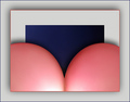
oops glad I went back to this photo, as I've noticed the hole :) Nice idea, nice image, hope others don't miss this, like I originally did! |
|
| Photographer found comment helpful. |
|
|
02/18/2006 12:47:00 PM |
|
Cool picture, great editing. It's along the same lines as mine, but mine is a little nicer. :-) |
|
| Photographer found comment helpful. |
|
|
02/18/2006 11:08:20 AM |
|
<3 Nice effect. Think I would have liked it better in colour. <3 |
|
| Photographer found comment helpful. |
|
|
02/18/2006 09:12:54 AM |
|
| Photographer found comment helpful. |
|
|
02/17/2006 12:25:37 AM |
|
very scary look youve got going here. I like the added touch of the wall in the heart. |
|
| Photographer found comment helpful. |
|
|
02/16/2006 04:21:53 PM |
|
| Photographer found comment helpful. |
|
|
02/16/2006 09:57:11 AM |
|
I think this is a cool image, but the fact that the entire thing is in B&W sort of takes away from the illusion a little. I think if the subject were to remain in B&W wile the wall was in color, the eye would be trained on the fact that you can see the wall through the subject. You also have a nice bit of color in the vines that might add some flare. |
|
| Photographer found comment helpful. |
|
|
02/15/2006 09:39:56 PM |
|
good idea ... but really hard to see the brick heart ... perhaps would have been more effective if it was larger |
|
| Photographer found comment helpful. |
|
|
02/15/2006 08:15:28 PM |
|
nice concept. i think a zoom/crop in closer would have made this skyrocket in. Because I want to focus on that area, but the image overwhelms that heart area. i'll give you a good score anyway for potential. |
|
| Photographer found comment helpful. |
|
|
02/15/2006 02:28:20 PM |
looks like a brick heart to me
its funny |
|
| Photographer found comment helpful. |
|
|
02/15/2006 09:45:41 AM |
|
This one took me a minute - I love it! It's very clever & well done. THe choice of black & white seems right for it. Good luck! |
|
| Photographer found comment helpful. |
|
|
02/15/2006 07:21:39 AM |
|
| Photographer found comment helpful. |
|
|
02/15/2006 05:05:50 AM |
|
great idea...well executed |
|
| Photographer found comment helpful. |
|
|
02/15/2006 03:36:56 AM |
|
| Photographer found comment helpful. |
|
|
02/15/2006 12:58:33 AM |
|
Pretty clever. Almost missed the effect! The title made me look harder! |
|
| Photographer found comment helpful. |
Home -
Challenges -
Community -
League -
Photos -
Cameras -
Lenses -
Learn -
Help -
Terms of Use -
Privacy -
Top ^
DPChallenge, and website content and design, Copyright © 2001-2026 Challenging Technologies, LLC.
All digital photo copyrights belong to the photographers and may not be used without permission.
Current Server Time: 06/29/2026 10:55:11 PM EDT.