| Author | Thread |
|
|
02/27/2006 10:51:22 PM |
* Greetings from the Critique Club *
First Impression:
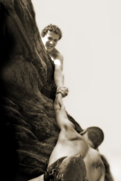
Well, I scored this a 6 during the challenge. My first impression was that while it certainly had strong emotional appeal, there were a few technical & meeting the challenge issues.
That being said and upon closer inspection (and after reading the other comments given), I will do my best to provide some constructive feedback. [Next time it might help the CC if you also left some photographer comments regarding your intentions, post-processing steps, etc. - Thanks!]
Composition:
I think this is one of the stronger points of the image. You've got nice leading lines to keep the viewer engaged and inside the frame. The diagonals and curves of the human body usually make an interesting and emotionally appealing composition, and they do here. The climber's shoe at the bottom is a distraction (as mentioned by several commenters) and probably caused your score to suffer a bit. Otherwise though, I think it's a very interesting shot that has a lot of potential.
Subject/Meeting the Challenge:
Your title of "Brotherhood" seems to have hurt you a bit too - because voters like to have a direct link to the challenge theme. However, it didn't hurt you that much, because 5.5+ certainly isn't a bad score at all. The subject matter of the shot obviously exemplified enough "virtue" for most voters to overlook this matter.
Technical (Color, focus, and light):
I like the duotone choice (as did several other commenters) - it seemed to me to add to the baseness & ruggedness of the image. The focus, however, worked against you. While soft focus can add to the artistic merit of some images, I think that in this case a sharp focus would have added to the rugged landscape and mood of the shot.
To grow its vote?:
A little better focus and perhaps cropping out the shoe at the bottom would have probably helped your score, but as I said before, 5.5 ain't bad. I'll take it any day! LOL
Summary:
From reviewing your profile & other challenge entries, congratulations on your second highest scoring shot. I'm sure that there are bigger and better things to come from you and I look forward to seeing them soon. This was a solid challenge entry with a good image.
Just my 2 cents...
Jimmy |
|
Comments Made During the Challenge  |
|
|
02/21/2006 10:29:50 PM |
|
shoe is distracting - otherwise great! |
|
|
|
02/21/2006 08:14:46 PM |
|
Idea is good - picture not so good |
|
|
|
02/21/2006 11:50:50 AM |
|
Nice shot. This would be even better if his shoe wasnt in the way |
|
|
|
02/20/2006 10:22:08 PM |
|
|
|
02/20/2006 12:58:23 PM |
|
A bit soft for me.. but I like the composition and the emotion felt in this shot. Nicely done! :) |
|
|
|
02/18/2006 11:24:08 PM |
|
I like the concept of this shot and think that sepia was a good choice... a crisper focus would improve this photo |
|
|
|
02/18/2006 05:12:53 PM |
|
|
|
02/18/2006 05:07:13 PM |
|
I can see a link to Fortitude. Strong line with the linked arms, but object in front of lower guy gets the attention from that line - and not sure what it is (more rock?). |
|
|
|
02/18/2006 10:43:29 AM |
|
I really love this shot, the coloring is so nice. |
|
|
|
02/18/2006 08:51:59 AM |
|
I like the expression on the man's face, and the color values you chose. The one thing I find distracting is the...rock(?) in the foreground against the other man's back. Looks odd, but that's just me. Otherwise, a good image. |
|
|
|
02/18/2006 05:04:12 AM |
|
Great composition and subject, I love it! Maybe focus is too soft, personally I think a stronger focus would work better here. |
|
|
|
02/18/2006 02:33:17 AM |
|
Nice idea and photo, personally I'd like to see this a bit sharper, nice leading lines though. |
|
|
|
02/17/2006 11:57:16 AM |
|
I don't like the foregrounded shoe. It ruins an illusion of nakedness. |
|
|
|
02/17/2006 10:21:04 AM |
|
Dont like his shoe.. but everything else i like, maybe if he was a bit more scared.. like seeing the mussels on the back of the other one :) |
|
|
|
02/16/2006 03:01:39 PM |
|
|
|
02/16/2006 02:46:32 PM |
|
nice concept and presentation |
|
|
|
02/16/2006 09:44:48 AM |
|
Great Shot; it could almost be a Raphael painting where god is on a cloud and reaching down to help ... what's a shame about it, is the back pack it does distract slightly from the rest, but other then that the composition, color and angle of the picture is truly fantastic !! |
|
|
|
02/15/2006 07:16:16 PM |
|
|
|
02/15/2006 01:06:03 PM |
|
|
|
02/15/2006 07:24:51 AM |
|
nice capture of the emotion. wish the focus was a bit tighter. like the contrast, although the rock at the bottom seems "odd" by interrupting the lower man's body. |
|
|
|
02/15/2006 02:14:40 AM |
|
What a fantastic capture! Its full of movement and emotion. It seems out of focus though. I like the diagonal line of dark/light. |
|
|
|
02/15/2006 02:12:42 AM |
|
Brotherhood isn't one of the virtues though. It's also all out of focus. |
|
Home -
Challenges -
Community -
League -
Photos -
Cameras -
Lenses -
Learn -
Help -
Terms of Use -
Privacy -
Top ^
DPChallenge, and website content and design, Copyright © 2001-2026 Challenging Technologies, LLC.
All digital photo copyrights belong to the photographers and may not be used without permission.
Current Server Time: 06/28/2026 11:00:49 AM EDT.