| Author | Thread |
|
|
07/23/2003 09:15:34 AM |
_
Message edited by author 2005-04-14 13:12:35. |
|
Comments Made During the Challenge  |
|
|
07/22/2003 09:00:50 PM |
|
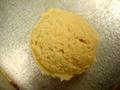
A neat idea, but the focus is just too soft on the photo. |
|
|
|
07/19/2003 08:12:51 PM |
|
This picture appears to be out of focus. |
|
|
|
07/18/2003 01:57:40 AM |
Does the shot fit the Challenge (8)
Photo Color (3)
Composition(3)
Focus(4)
Background(4)
Lighting(3)
Conclusion:
The Theme is round and you have captured that here. I would say that I think the color is not very good and that may be due to poor white balance choice. You took this shot from an wierd perspective and I think it does not suit well. One of the only times you will ever hear me say go wider angle. I do not know what you were trying to achieve with this focus but it is very soft. The background in itself can barely be seen so there is not contrast. The lighting is nothign to write home about. Looks like Normal house lighting. For something like this I woudl have tried to suspend the ball and make it look like it was just levitating. I guess I am just a weakling for special effects.
Overall Score(4)
|
|
|
|
07/18/2003 01:41:10 AM |
|
|
|
07/17/2003 07:31:33 PM |
|
IMHO, this is just too close. I get the sense of round, yes, but the focus isn't tack sharp (needs to be for this one). The lighting ranges from O.K. to harsh (on top), which completely wipes out any detail up there. 5 Rob the Swash |
|
|
|
07/17/2003 12:46:39 PM |
|
The concept behind this photo is quite strong and the idea is good. I don't traditionally thing of golf balls as having a yellow tint. This is probalby cause by white balance issues and could be corrected rather easily also. This image should probably also be sharp instead of out of focus. I can't see how the choice to make this soft focus is really helping the image. |
|
|
|
07/16/2003 10:21:09 PM |
|
Cool shot but somewhat grainy. |
|
|
|
07/16/2003 11:44:12 AM |
|
Good entry but the focus is too soft for this to be a winner. |
|
|
|
07/16/2003 09:40:04 AM |
|
poor cropping, blurry and grainy picture. The light reflected on the shiny dimples are un-uniformed and the background distracting. Subject (golf ball) colour is dull and saturated. You could have created a very nice "light and shadow" effect on this one, but I guess there are still things to work on. |
|
|
|
07/16/2003 03:00:03 AM |
|
|
|
07/16/2003 01:44:09 AM |
|
A bit out of focus. Good luck |
|
|
|
07/16/2003 12:18:22 AM |
|
Good macro, being a golf ball, I would have choosen a white ball, and if it is, it certainly needs some colour correction. |
|
Home -
Challenges -
Community -
League -
Photos -
Cameras -
Lenses -
Learn -
Help -
Terms of Use -
Privacy -
Top ^
DPChallenge, and website content and design, Copyright © 2001-2026 Challenging Technologies, LLC.
All digital photo copyrights belong to the photographers and may not be used without permission.
Current Server Time: 06/30/2026 10:43:01 AM EDT.