|
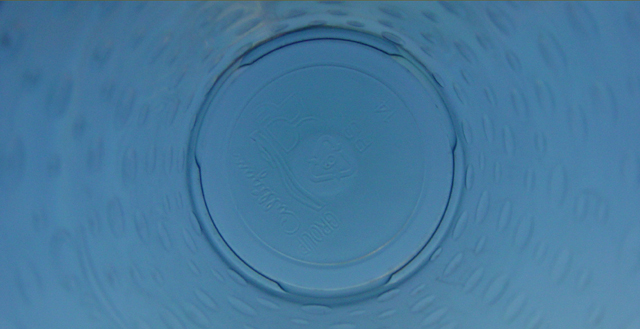
Hey, Culligan Man! ;-) A more sqare crop would have worked better to accentuate "round" to me. And while I joked about the Culligan logo, the writing at the bottom is a bit of a distraction. But I like the color, the focus is well enough on the bottom of the bottle, the dimples or droplets are a nice effect, and the DOF works well. |






 Add photograph to your favorites
 Add photographer to your favorites


 Photographer found comment helpful.


