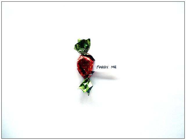
This is really sophisticated. I could see this as a Valentine card (you should consider trying to sell it to a greeting card company, actually, but first clone out the shadow). I didn't vote in this challenge but this would very likely have been my top pick. Once again, I find myself humbled by a young'un. ;D
This is a great idea, and executed very well. I think it may have been stronger if it wasn't quite so centered. . but I really love the idea and the way it looks. Good job.
I like this idea. I would try levels or curves to see if I could get the background completely white. It might bring out more details of the candy wrapper, too. (Or maybe not, I'm not that experienced yet!) I also think having the candy off center would add more interest.
Very nicely done. I think this one really benefits from the white space. However, I think there might just be a little too much white space. There appears to be some vignetting on the corners, so I wonder if a slightly tighter crop would have helped. All in all, this is a really good shot. +7
I think that this would have been a stronger presentation if you hadn't blown out the edges of the paper. On my monitor the text almost appears to be written on the background; only the shadow remains to indicate otherwise. The exposure meter in your camera will assume that on a properly exposed image, averaging the brightness of the entire frame will produce a uniform grey image; usually this heuristic works, but it is dead wrong when shooting a small object against a white background. With a shot like this you'll need to adjust your exposure to compensate for your camera's assumptions.
Generally not a bad image and a marvelous concept.
You might consider two changes:
1-Try a smaller crop or apply different post processing to remove the distracting vignetting and/or color casting from showing up on the corners. 2-Position the candy centered at either the upper or lower left "rule of thirds" intersection point for increased viewer esthetics.





 Add photograph to your favorites
 Add photographer to your favorites


 Photographer found comment helpful.


