| Author | Thread |
|
|
02/03/2006 12:15:04 AM |
|
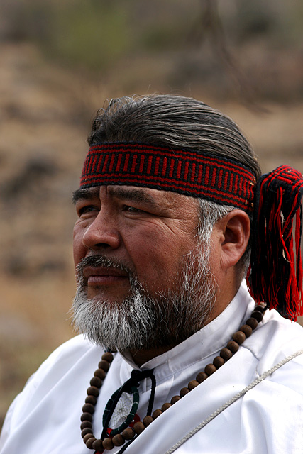
Really nice portrait Ramevi, I really like how natural this portrait looks. |
|
 Photographer found comment helpful. Photographer found comment helpful. |
Comments Made During the Challenge  |
|
|
01/30/2006 07:00:45 PM |
|
His face is a bit dark. A good candidate for some light dodging. |
|
| Photographer found comment helpful. |
|
|
01/29/2006 10:35:41 PM |
|
little too much empty space up top, but other wise great detail. 8. |
|
| Photographer found comment helpful. |
|
|
01/29/2006 01:51:21 PM |
|
Very nice portrait. The face is very good--nice catchlights and expression, lots of detail, and good lighting. However, there seems to me to be too much negative space at the top of the frame. You might want to crop down to about 3/4" above the model's head. Also, there are some hotspots on the white shirt that you might want to tone down a little. |
|
| Photographer found comment helpful. |
|
|
01/28/2006 07:02:28 PM |
|
nice idea, color good, too much negative space on top therefore crop needs work, b&w good, nice light, nice dof, nice angle, nice texture, good portrait, overall just a nice piece |
|
| Photographer found comment helpful. |
|
|
01/26/2006 06:04:48 AM |
|
Powerfully strong portrait image, taken here.....and taken very well. |
|
| Photographer found comment helpful. |
|
|
01/25/2006 04:47:52 PM |
|
Technically well done portrait. I miss the eye contact. All this imo, obviously. Good luck! |
|
| Photographer found comment helpful. |
|
|
01/24/2006 05:05:38 PM |
|
Just an opinion but I think this could have been cropped almost to the top of the guys head. Otherwise great exposure, nice tones. |
|
| Photographer found comment helpful. |
|
|
01/20/2006 11:07:18 AM |
|
Nice environmental portrait. It really conveys a bit of who this man is. |
|
| Photographer found comment helpful. |
|
|
01/20/2006 01:27:10 AM |
|
Man this great. If I had to be picky, it would be the brown brach above his head. |
|
| Photographer found comment helpful. |
|
|
01/19/2006 07:53:00 PM |
|
| Photographer found comment helpful. |
|
|
01/18/2006 10:56:52 PM |
|
| Photographer found comment helpful. |
|
|
01/18/2006 01:19:44 AM |
|
Nice technically, but woul dhave pulled down and left less empty space overhead. That, or composed horizontally. |
|
| Photographer found comment helpful. |
|
|
01/17/2006 10:07:05 PM |
|
| Photographer found comment helpful. |
|
|
01/17/2006 07:27:09 PM |
|
Nice portrait and great expression around the eyes, but I feel too much space is left at the top. |
|
| Photographer found comment helpful. |
|
|
01/17/2006 03:33:29 PM |
|
Good portrait, seems to be a bit too much space above his head, a slightly tighter crop may have helped. Nicely executed shot however as far as colour, DOF and exposure. |
|
| Photographer found comment helpful. |
|
|
01/17/2006 12:53:57 PM |
|
Too much space at the top. Too much space makes him appear short. I would think you would want this fellow to fill the frame, with his eyes on the third. Great expression, colors. |
|
| Photographer found comment helpful. |
|
|
01/17/2006 02:40:24 AM |
|
I wish there was more light on his face or at least one side of his face. |
|
| Photographer found comment helpful. |
|
|
01/16/2006 04:34:52 PM |
|
Such character in that face!!!!! |
|
| Photographer found comment helpful. |
|
|
01/16/2006 11:01:47 AM |
|
| Photographer found comment helpful. |
Home -
Challenges -
Community -
League -
Photos -
Cameras -
Lenses -
Learn -
Help -
Terms of Use -
Privacy -
Top ^
DPChallenge, and website content and design, Copyright © 2001-2026 Challenging Technologies, LLC.
All digital photo copyrights belong to the photographers and may not be used without permission.
Current Server Time: 06/27/2026 07:04:19 PM EDT.