| Author | Thread |
Comments Made During the Challenge  |
|
|
01/22/2006 11:37:39 PM |
|
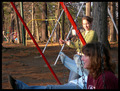
Focal point does not take up enough space in the frame. |
|
 Photographer found comment helpful. Photographer found comment helpful. |
|
|
01/22/2006 02:47:14 PM |
|
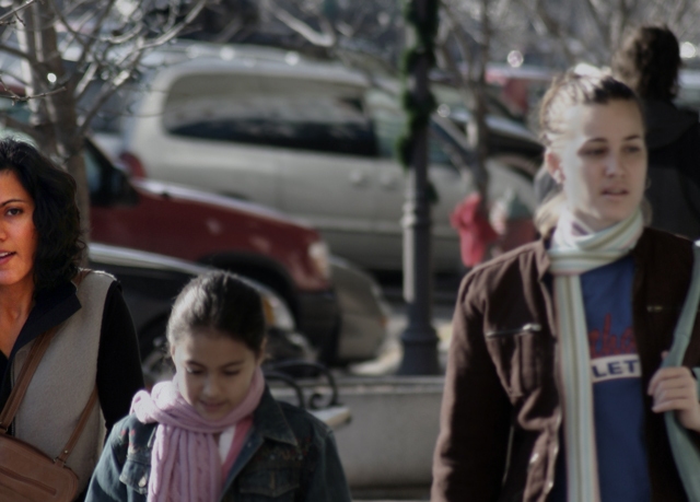
I think I understand what you were going for here but it gives the photo a doctored look to it. And I had to search for the subject...it wasnt immeditaly obvious with the soft focus on the right two subjects. |
|
| Photographer found comment helpful. |
|
|
01/22/2006 07:46:46 AM |
|
composition is awkward for me. Great idea, I just think there are too many distracting elements in the rest of the scene to pull this off effectively. |
|
| Photographer found comment helpful. |
|
|
01/21/2006 11:26:50 PM |
|
Good use of shallow DOF to isolate your subject. I would have preferred the whole face of the subject to be visible, but that is only my preference. Good luck |
|
| Photographer found comment helpful. |
|
|
01/19/2006 03:10:10 AM |
|
Okay, half the girl on the left is singled out using a boost of colour, but I see no DOF isolation, nor a thoughtful composition. |
|
| Photographer found comment helpful. |
|
|
01/18/2006 06:19:23 AM |
|
Like the idea but somehow it doesn't to it for me. |
|
| Photographer found comment helpful. |
|
|
01/16/2006 03:36:00 AM |
the focus on the woman on the far left brings out the differences between her and the other two people in a way that does not do good things for this shot; the difference is too stark. and while that can sometimes be good, it simply does not work in this case.
also: please explain title. i jus' dont get it. |
|
| Photographer found comment helpful. |
|
|
01/16/2006 03:34:03 AM |
|
This is offensive, and if you don't know why, you're offensive. |
|
| Photographer found comment helpful. |
|
|
01/16/2006 01:49:03 AM |
|
Cool idea but I'm really uncomfortable with the composition. I was about to mark it a 1 when I finally saw the girl on the left. It probably shouldn't be that hard :) |
|
| Photographer found comment helpful. |
|
|
01/16/2006 01:35:39 AM |
|
Ok she meets the challenge, my problem is that she is not really the focus of the picture. |
|
| Photographer found comment helpful. |
|
|
01/16/2006 12:50:12 AM |
|
not sure about the composition here...the lady on the left looks cut in half and the girls in the front look flat (colour wise) |
|
| Photographer found comment helpful. |
Home -
Challenges -
Community -
League -
Photos -
Cameras -
Lenses -
Learn -
Help -
Terms of Use -
Privacy -
Top ^
DPChallenge, and website content and design, Copyright © 2001-2026 Challenging Technologies, LLC.
All digital photo copyrights belong to the photographers and may not be used without permission.
Current Server Time: 07/01/2026 01:09:23 AM EDT.