| Author | Thread |
Comments Made During the Challenge  |
|
|
01/17/2006 10:30:20 PM |
|
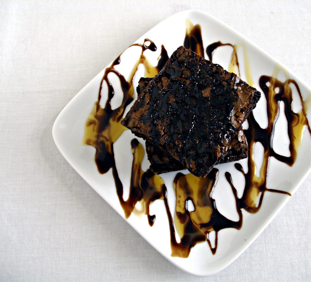
I kind a wish the brownies were lined up with the corners of the plate and then the plate lined up better with the framing and that the right side weren't cropped off - it's a great image - love the drizzle effect you made - the colors are nice the lighting is good and it looks very yummy :) |
|
 Photographer found comment helpful. Photographer found comment helpful. |
|
|
01/17/2006 10:02:37 PM |
|
YUUUUUUUUMMMMMMMMM. looks great just like a picture should do for food. |
|
| Photographer found comment helpful. |
|
|
01/17/2006 08:37:40 PM |
|
I think this might be one of those rare images where centering works well... Anyway, I find that I (if only me) am distracted by the crop on the right. |
|
| Photographer found comment helpful. |
|
|
01/17/2006 06:04:58 PM |
|
presentation is everything - this is wonderful. |
|
| Photographer found comment helpful. |
|
|
01/17/2006 01:29:55 AM |
|
Not too crazy about the DOF here. The top brownie seems suspended and almost has a dizzying effect on me. |
|
|
|
01/16/2006 05:39:29 PM |
|
Unsure if I feel the topping on the plate should be in sharper focus or not but this is a very well composed shot. A good food image should look delicious and this certainly does! Think I'll go get something to eat. :) |
|
| Photographer found comment helpful. |
|
|
01/15/2006 07:50:52 PM |
|
Chocolate is always a fine subject. With this image, though, I don't get a sense of chocolate. Anyway, a different angle may have done the trick, like maybe a side view with chocolate dripping down the edge. The color could also be adjusted to look more brown than black, so color balance adjustment would have helped. LIghting needs to be done in such a way that it enhances the chocolate to give it a more smooth appearance. |
|
|
|
01/15/2006 12:20:19 PM |
|
I am a chocolate lover... this looks delicious! |
|
| Photographer found comment helpful. |
|
|
01/15/2006 10:05:26 AM |
|
yum... presentation looks great |
|
| Photographer found comment helpful. |
|
|
01/14/2006 11:59:46 PM |
|
I like this one a lot. Nicely done and very tempting. I like the fact that the plate is angled and the lighting works well. IMO, I think just a slightly lower angle, but still from the top would have shown the height better and added to the picture. Of course that is only my opinion. Well done and good luck |
|
| Photographer found comment helpful. |
|
|
01/14/2006 11:14:26 PM |
|
I bet this is tasty.. maybe stick a fork in it. |
|
| Photographer found comment helpful. |
|
|
01/14/2006 04:33:02 PM |
|
Great presentation... looks delicious!! |
|
| Photographer found comment helpful. |
|
|
01/14/2006 02:46:39 PM |
|
Nice decoration, but the overal presentation of this is not very well thought out. Lighting is medicore, and the shot could of been taken from a lower angle. |
|
|
|
01/14/2006 12:41:32 PM |
|
i like the shot, it just needs a little more depth. |
|
|
|
01/14/2006 09:03:30 AM |
|
Excellent setup, and YUMMY something about the cropping isn't sitting well with me and I think the weave of the table cloth is a bit distracting. |
|
|
|
01/13/2006 12:57:44 PM |
|
Seems a bit out of focus to me? Maybe the depth of field is too shallow? |
|
|
|
01/13/2006 12:24:42 PM |
|
IMHO needs a little longer DOF and some light from above, left....6 |
|
|
|
01/12/2006 04:00:40 PM |
|
Nice picture, but more DOF would have helped |
|
|
|
01/12/2006 01:29:59 PM |
|
You have an intesting DOF here, I also think that having the cake on thirds has worked well for you. |
|
|
|
01/12/2006 12:03:45 PM |
|
In my opinion you didn't get anything with cropping out the right part of the plate. |
|
|
|
01/12/2006 04:22:52 AM |
|
| Photographer found comment helpful. |
|
|
01/11/2006 08:56:45 PM |
|
i love your viewpoint and composition. i do wish that the corner on the right of the plate wasnt cut off by the frame though. |
|
| Photographer found comment helpful. |
|
|
01/11/2006 04:04:21 PM |
|
The off center doesn't add to this photo IMHO |
|
| Photographer found comment helpful. |
|
|
01/11/2006 02:32:43 PM |
|
Lost the height of what you have built up in your dish but technically everything else is pretty good |
|
| Photographer found comment helpful. |
|
|
01/11/2006 01:55:56 PM |
|
Nice topping design and color contrast. More DOF would help, and less-straight-down composition would be more interesting. |
|
| Photographer found comment helpful. |
|
|
01/11/2006 01:52:43 PM |
|
A chef and a photographer. Great shot. |
|
| Photographer found comment helpful. |
|
|
01/11/2006 01:34:46 PM |
|
Not sure why you chose to cut off one side of the plate, photo looks unbalanced. |
|
| Photographer found comment helpful. |
|
|
01/11/2006 11:55:35 AM |
|
Too many calories for me... But I don't think I could resist. |
|
| Photographer found comment helpful. |
|
|
01/11/2006 03:40:02 AM |
|
| Photographer found comment helpful. |
Home -
Challenges -
Community -
League -
Photos -
Cameras -
Lenses -
Learn -
Help -
Terms of Use -
Privacy -
Top ^
DPChallenge, and website content and design, Copyright © 2001-2026 Challenging Technologies, LLC.
All digital photo copyrights belong to the photographers and may not be used without permission.
Current Server Time: 06/30/2026 12:19:51 AM EDT.