Author Thread
Post actions
This image was TERRIBLY underscored. AGH!
bad photo can score so well makes it appropriate and fitting that an inarguably good image scores poorly.
Comments Made During the Challenge
Post actions
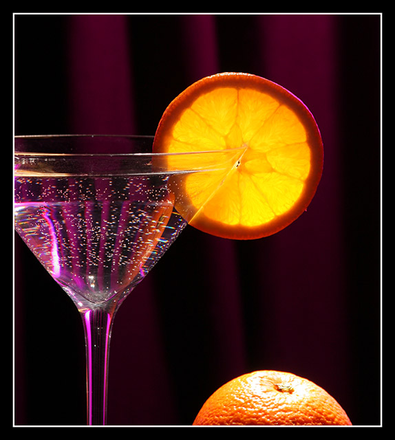
this is the best example of a violet - red - orange - yellow-orange analogous color scheme I have ever seen on DPC, possibly in any photograph ever
Post actions
Nice elements and pretty good compostion with combination of transparency, translucency, and sphere highlight. Wish for better focus on orange slide, sharpness, and DOF. Good idea, and close to being great but for focus/DOF.
Post actions
Very well done with killer colors. Bumping up.
Post actions
Very nicely done. You've got a good DOF and a good focal point. A bit of a glare on the bottom orange detracts a bit. (It's nothing that couldn't be cured in the long run with a little bit of burning, but that is outside the scope of the contest.) I really like the way the difraction of the light occurs as it goes through the glass and liquid. Once again nicely done.
Post actions
Post actions
I can almost hear Tevia singing, "Sunrise...Sunset..."
Post actions
i don't like the purple light, it just doesn't go good with orange imo,
Post actions
Nicely done, love the vivid colors and the touch of purple on the stem is great.
Post actions
An ad worth photo...I don't even know what's in the glass....but I sure do want it!!! 10's 4U
Post actions
Wow, factor here again, so, so good..... Another one of my favorites.....
Post actions
Post actions
pretty, but i think the actual orange distracts from the glass.
Post actions
good idea.imo it's too much red in the orange. i would have desat the red tones a little bit or/and displaced them into cyan or green a bit.
Post actions
i would have preferred the orange at the bottom be removed. its distracting to an already stunning image
Post actions
Nice job on high lighting the orange, it really jumps out. The reflection in the glass begs attention of my eye and draws my away. 6
Post actions
this is nice. good composition and colors.
Post actions
Too bad about those blown highlights on top of the orange.
Post actions
I like the reflection of the whole orange in the side of the glass.
Post actions
Nice set up, I like the idea, only the glare on the orange at the bottom is overwhelming.
Post actions
I think the orange at the bottom distracts and It would be better to not have it there...
Post actions
I'd like this much more if the orange at the bottom were gone. It kind of pulls the rest of the image down. I like the pink of the glass.
Post actions
I like it, but I think the frame spoils it
Post actions





 Add photograph to your favorites
 Add photographer to your favorites

 Photographer found comment helpful.


