| Author | Thread |
|
|
01/30/2006 10:33:17 PM |
|
I don't know about the blood, but an empty band-aid wrapper would have made it work for me;) |
|
 Photographer found comment helpful. Photographer found comment helpful. |
|
|
01/30/2006 08:08:48 PM |
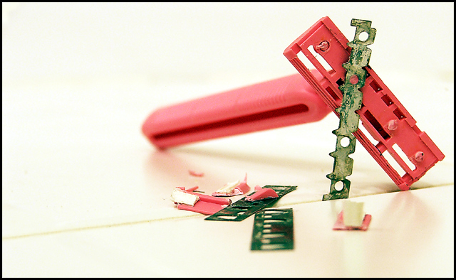
I think a few drops of blood (nothing excessive) would have made a nice impact on the picture.
I'm not too keen on the line across the table(?) and I must admit that upon first glance I wasn't immeadiatly aware of what the subject matter was, I went straight to the desrciption and worked it out from there.
Maybe it's because the handle is pink and the blades are green rather than the silver/black/chrome things that I am used to? |
|
| Photographer found comment helpful. |
|
|
01/19/2006 04:28:44 AM |
Greetings from the Critique Club
Technical Qualities
Technically I think the shot is quite good. The shallow depth of field really draws attention to the blade (the colour of the handle still competes a little but would have been worse if it was in focus). Lighting is very good - nice soft back lighting which washes out the handle more than the blade.
Composition / Subject
It's an interesting composition - The various angles all sit together well, and even though it's placed more into the top-right corner than what a lot of people would consider doing it works really well.
The only aspect I don't like is the diagonal line into which the blade is wedged. I'm assuming it was to hold the blade upright, but it really adds nothing of value or interest to the shot and draws your eye out of the frame.
Border / Title
The basic black border works pretty well. There is essentially nothing black in the shot (it's bordering on high-key in my opinion) so it sits alone and just frames it nicely.
The title is great - Before reading the description you provided I simply thought of the irony of fairly festy looking blade wrapped up in such a pretty pink handle, designed to "make people pretty" (at least according to the marketing folks).
Emotional / Challenge
The shot doesn't have the same emotional impact as it would have if fake blood, or the simple presence of a wrist - I took it more as a comment in beauty and what the public considers beautiful for females.
I think the shot meets the challenge, even though it ranked very low. That's kind of natural for this type of shot on this site though. In particular, when compared to the other shots you have submitted it's very colourful, and also very clean. For your work it truly is a burst of colour.
Summary
Keep up the great work - Your shots won't often score highly here in DPChallenge (unless the topic suits) but that shouldn't discourage you at all. You have both technical skill and also an artistic eye (probably much more than myself), and it's great to see images that deviate from the norm. So many people are more concerned with a high score than expressing themselves.
|
|
| Photographer found comment helpful. |
Comments Made During the Challenge  |
|
|
01/14/2006 09:33:59 PM |
|
Nice POV, composition, and DOF to make this everyday object compelling to look at. The detail and focus look spot-on as well. IMHO the tonality of the shot seems a tad on the warm side. Maybe some WB correction in the RAW stage would have added to the shot? Just my opinion, nice shot nonetheless.... 7 |
|
| Photographer found comment helpful. |
|
|
01/11/2006 11:39:47 AM |
|
its okay but the color isnt bursting out at me |
|
| Photographer found comment helpful. |
|
|
01/09/2006 02:36:33 PM |
|
Simple subject, excellent photograph, very well done. |
|
| Photographer found comment helpful. |
|
|
01/09/2006 12:56:10 PM |
|
Different but not appealing. |
|
| Photographer found comment helpful. |
Home -
Challenges -
Community -
League -
Photos -
Cameras -
Lenses -
Learn -
Help -
Terms of Use -
Privacy -
Top ^
DPChallenge, and website content and design, Copyright © 2001-2026 Challenging Technologies, LLC.
All digital photo copyrights belong to the photographers and may not be used without permission.
Current Server Time: 06/29/2026 07:46:23 AM EDT.