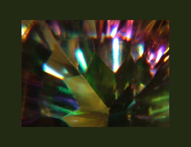
First, as many people noted the border is over done. I am not a fan of borders, but when properly done should be a small percentage of the image (and I prefer white, but that's me.)
Challenge
- Relevant to the Challenge? Yes, although the colors area bit dull.
- Is subject unique (vs. unoriginal or rehashed)? Yes
Compostion
- Good or Bad? How can it be fixed? Um, I can't really respond. Well, okay. It's an abstract. There is little composition when discussing abstract.
- Good focus? I would say yes and no. What lead me to say this is that the edges of the facets are sharp near the center of the image, but I'd like them to be sharp through the entire image. Many people mentioned the focus, but I think the are confusing the lighting reflected in the top 1/3 of the image as the subject.
Lighting
- Good use of light? No. I am guessing overhead flourescent tubes. What makes me guess this is the long blueish-white reflections in the top facets.
Aesthetics/Artistic Appeal:
- Colors and Contrast. As mentioned before, the colors are a bit dull. In post processing, bring the saturation up some and adjust the contrast and brightness to make the colors come out more.
- What is my reaction or feelings? It's absract, but I like it. It could be better, but I like abstract even though abstract doesn't score well here.
The focus on this picture could be better, it feels a bit soft which makes it hard to tell what it is. I think it would have scored higher if it weren't for that.
Nice lines and colors in this shot. The detail and focus on this macro are nice. The one thing that really detracts here is the frame. The overwhelming size of it really 'crowds' the subject.
The shot has some fun colors, but it's very hard to tell what I'm looking at. (Which may be intentional.) Also, the thick border is a bit too much for my taste.
This is an interesting shot. I found the gist of the picture distracting and the border is the thing that seems to bring most of the colour. Nice try at an interesting shot.





 Add photograph to your favorites
 Add photographer to your favorites


