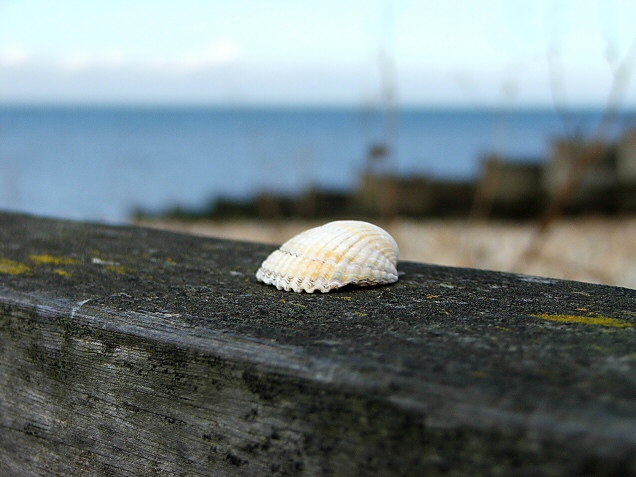
This is sharp and shows great DOF, but I would have found a better surface upon which to place the shell. That concrete wall is just not appealing, especially considering how prominent it is in the photo.
This is a great idea. And an interesting use of dof. I like the detail in the wood, and the shell stands out well as the subject. I like centered comps when they work well, but in this case it seems like it could have much stronger dynamics compositionally if the shell were out of the center, maybe out closer to a thirds intersection.
I like the zig zag of the diagonal lines here. I might have preferred the seashell (and it's area of sharp focus) to be at the end of the Z path. Centuries of art have shown that the human eye likes to look at something slightly off center, the rule of thirds might seem trite but it works, and I think it would have worked here.
Nice shot. The shell is a bit central for me. Would like to see a different crop and IMHO the composition would be a lot stronger. The colours and textures are interesting.






 Add photograph to your favorites
 Add photographer to your favorites

 Photographer found comment helpful.


