Cloning, dodging, burning, etc. to improve your photo or remove imperfections or minor distracting elements, etc. is acceptable. However, using any editing tools to duplicate, create, or move major elements of your photograph is not permitted.
Statistics
Views since voting: 1477 Comments: 17 Favorites: 1 (view)
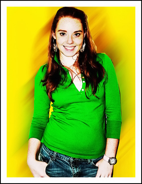
This looks a little over processed for most of the DPC crowd. The lighting looks a little harsh; softer light would have probably been more flattering. I think that I would have opted to include less of the model's jeans in favor of giving her a little more headroom.
I like the colors and the composition, and the girl is a charmer. I'm not sure how you achieved this, but to me the girl looks like a cardboard cutout. The ragged outline and angularity of her shirt, hair, and left hand make this look like it was shot on a completely different background and then cut out with the Lasso tool. There are things that I like about this picture, but the processing appears clumsy.
the image is excellent and your comp is perfect. To me the only minor drawback is that there may not be enough seperation between subject and background to truly meet the challenge perfectly but no big deal... Image is excellent.
I like this in a weird 80's graphics kind of way. The cropping is cutting it close near her head, however. Also, there is a harsh line of shadow along her right arm, and an area of darkness between her left arm and her jeans that give this a weird cut-out appearance. I think the cloning could have been a bit smoother.
I normally don't like portraits that have been overly treated, or post-processed in any way. But given the challenge theme, I think the effect you've used works well to emphasize it and create a "feel" appropriate to this challenge. The high contrasts and loud colors work well here.... 7
A very nice portrait and edit.
However, you shouldn't have used the yellow background.
Yellow is the first color the human eye will notice. (assuming we are not talking about the color-blind)
Thus the eye will be drawn to the background rather then to your subject.
Unless the background IS your subject.
For me this is a very good photo but do not meet the challenge.
interesting treatment. a shot well worth some effort. the colours are great, and somehow even the black line on her right arm kind of fits, though it would look more like it's meant to be there if there was more of it and if it occurred in other areas as well.






 Add photograph to your favorites
 Add photographer to your favorites


 Photographer found comment helpful.


