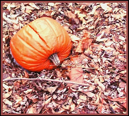
First Impression - the most important one: Good composition, but it looks overexposed....causing the colors to be muted.
Composition: Composition for this image is good! The pumpkin is well placed and I like the leaves as a background.
Subject: The pumpkin was a nice choice in subject, especially as the colors would compliment the leaves well. A fresher pumpkin might go over a tad better, but I wouldn't call it a bad choice by any means!
Technical (Colour, focus, and light): The colors in this photo suffer a bit because of overexposure. For this challenge especially, the colors really need to pop off the screen in order to catch the voter's attention. Try reducing the exposure to get more accurate colors. Adding a little bit of saturation to the pumpkin would be a good move too. Focus looks alright, though it might be interesting to use a shallower depth of field (smaller aperture) to blur the leaves in the background a bit.
To grow its vote?: I think the overexposure is what hurt this image the most. A little bit of overexposure can sometimes be fixed using a Levels adjustment and/or adjusting the Contrast/Brightness.
Summary: Good composition on this photo! With a little more attention to the exposure settings it would come out really nicely.
The leaves are kind of "busy" - it may have been better to use a shallower depth of field to get part of the pumpkin sharp and let the leaves blur a little.





 Add photograph to your favorites
 Add photographer to your favorites

 Photographer found comment helpful.


