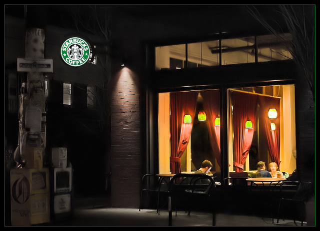
The original is actually a 1942 oil by Edward Hopper called "Nighthawks". I chose,instead, the arguably better known homage "Nighthawks - Boulevard of Broken Dreams" by Gottfried Helnwein. I liked the title of Helnwein's so, this is a homage of an homage.
Post-production is fairly involved. After I double converted a RAW shot to expose once for the lights and once for the rest, here's a list of levels in PS:
Burn (outside, mainly on telephone pole)
Sharpen
Healing Brush (on Lights)
Clone (Background Car, a clapboard sign partially in the picture, and reflections in the windows.)
Hue/Sat (sat sbux sign, desat outside, resat brick a bit and newspaper box)
Levels
Neat Image
Border
Statistics
Place: 19 out of 244 Avg (all users): 6.3817 Avg (commenters): 8.3103 Avg (participants): 6.1842 Avg (non-participants): 6.5591 Views since voting: 7266 Views during voting: 366 Votes: 241 Comments: 42 Favorites: 9 (view)
Ala Gottfried Helnwein? Try Edward Hopper. Helnwein did a painting that IMO, completely ripped off the original masterpiece known as "Nighthawks" by Edward Hopper...look here to see what I am talking about...enough of the art history lesson. About the image...ya did good! I immediately thought of "Nighthawks" when I saw this...{BTW "Nighthawks" is my ALL TIME favorite painting ever...I used to go to the Art Institure and just ponder it for lengthy amounts of time..so I'm strange, perhaps thats why I'm slighty offended you have given credit to Helnwein.} Anyway, I do like this image alot, the warmth of the indoor light contrasted against the cold light outdoors, then again I am biased in a sense. My only "dislikes", and these are only my opinions, really are the Strabucks sign...kinda makes this seem a bit like, well...an advert. for Starbucks IMO...perhaps try one where you have cloned that sucker out? Also, the image seems a tad overboard with it use of some sort of noise reduction/smoothing? It seems that there should be a bit more texture/definition happening with the brick and the utility pole...esp. when compared to that crispy Starbucks sign. Other than that I think this is super nice.
Post PM: I'm glad to see you know the original...but knowing what I know now...it's kind of a silly reason (IMO) to use the Helnwein shout out just for the sake of the title..."Boulevard of Java Dreams" would have been just fine on it's own...AND...you wouldn't have been subjected to this insanely long comment !
I really like this scene you've captured. It has a great urban and candid feel to it. IMHO I would have liked to see the Starbucks sign desaturated as well since I think the windows create an intersting enough subject to be the focal point here. the focus ins some areas also seems a bit soft for my tastes. Just my opinion, nice shot nonetheless.... 8
Very Edward Hopper-esque...I like the moodiness of this. This wasn't the type of shot I envisioned for "A Burst of Color" but I can't argue that there are colorful (if subdued color) elements in an otherwise neutral background. I just noticed the title. I will have to look up Gottfriend Helnwein.
Very nice image... I am strugelling with different exposure requiring shots like this. You have exposed inside and outside perfectly. I could use some advice.
To me, this is reminiscent of that poster you often see of James Dean, Hunphry Bogart and Marilyn Monroe in a diner. Would I like it more without the Starbucks sign? Maybe just a little. Here's a 9 for you.
I love how all the different light sources here are so nicely balanced, with nothing too over or underexposed. Very good interpretation of the challenge, too.
It's a wonderful, crisp shot. Great lighting. My only concern is that the challenge would make me think that the starbucks sign is the subject (with the matching green border). However, the people inside seem like a much more interesting subject for the picture. Either way, very nicely done!
now this is an outstanding image! fits the challenge perfectly. i could see this as a huge print. reminds me of the "Nighthawks" painting by Edward Hopper. this should take a ribbon.
Nice (more) modern version of Nighthawks. Color-wise a bit muted, but the warm light does burst out into the dark street. Perhaps a bit too much neat-image? Nicely composed. Very pleasant to look at.
To me, this suits the challenge perfectly. That one spot of POW amidst the drabness of tones in the rest of the shot. To be honest, I wish the green and white Starbucks sign weren't there, it distracts a bit for me. 8





 Add photograph to your favorites
 Add photographer to your favorites

 Photographer found comment helpful.


