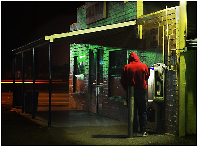
Shot on street near my house. Colors from traffic lights(green) mercury vapor light(yellow).
PP
Raw conversion
Bump red and green saturation very slightly, Green color was a little more blue orginally so did a selective hue layer to give more green.
dup layer, hard light @ ~10%
dup layer, soft light, mask out center area of subject and pool of light
clone some small distracting reflections and lights across the street,
dodge/burn
add border
resize
sharpen
save for DPC
Statistics
Place: 66 out of 244 Avg (all users): 5.8263 Avg (commenters): 7.6154 Avg (participants): 5.5983 Avg (non-participants): 6.0504 Views since voting: 1284 Views during voting: 347 Votes: 236 Comments: 15 Favorites: 1 (view)
Can I really find anything wrong with the Composition? Not really, interesing depth of detail and many different elements to gawk at. Lots of detail and interesting colors and constrast. The textures on the wall and ground, the interplay of the light....
But then, maybe what this challenge called for was a certain kind of simplicity. A clear and definite message or subject that jumps up and grabs you by the ears and says, "look right there moron!" I don't know, If you look through the top 30, this is mostly what you do see though. You have so much depth of detail in this image that some of the lesser elements compete for attention. While most of the time I would like that, maybe not for this challenge.
Another issue might be the high contrast. I looked at this on a few different monitors that are here at work. One SuperbrightNEC, one that is always too dark, and one that is middle-ish. The orders of magnitude in sharpness and detail are much different on all three. The one that is too dark gave the subject focus that I was talking about before, suggesting that maybe even more burning, or possibly a shorter shutter would have been apropriate.
Overall I really like this image though and think that it should have been given a more fair judgement. However, speedvoting, and badly calibrated monitors do not do this image justice.
Very interesting sceene. I like the composition a lot. It has a bit of a grungy feel, while still being a clean photo. The only thing I can think to recommend, (if this is not a candid shot) is not having the junk on the phonebooth. Very nice.
Wow-great and unusual capture for the challenge-It's refreshing to see a "real" environment that tells a story. The colors and image are very well composed and the lighting is real cool. Nicely done and one of my favorites here-9
Great photograph, very arty and moody. The bright colors of the building almost compete rather than offset. Almost but not quite, subject is offset.
Well done!





 Add photograph to your favorites
 Add photographer to your favorites

 Photographer found comment helpful.


