Very good. I was wondering how this would look if it were a little wider to the left- leaving a more obvious hole in the image where the fallen tree would have been. Excellent exposure. 7.
shape does not stand out as the subject of this photo. Although the title and photograph do go very well together that is not the result I am looking for.
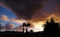
Great idea! For this theme though, I'd experiment leaving more open space in the top left corner by shifting an image slightly to the right. More open space would emphasize the caption.






 Add photograph to your favorites
 Add photographer to your favorites


 Photographer found comment helpful.


