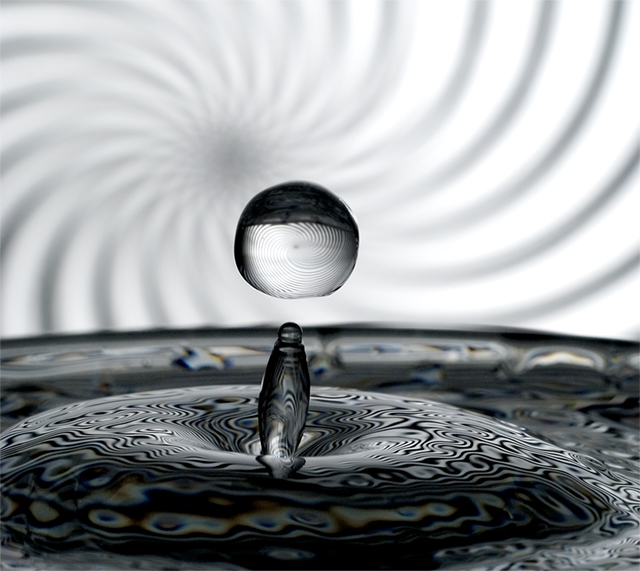
Love this. The one thing that would make it better would be a symmetrical presentation. It is just off center and I think that detracts a bit. Just my opinion though :) Well done. -8-
A different take on a typical subject. I know the intent is to get the spiral to show in the drop but I actually like the effect it had on the water surface itself. Lots of crazy lines to keep your eyes going.
I like the swirly pattern. I think desaturating to total B&W would have been a good idea, since I find some of the colours in the water a little distracting,.
yet another splash... I find the image too dark, the pattern is too distracting and the outline in the background is too fuzzy like a bad photoshop work.
what I like is how you captured the splash, the curves and the floating drop of water.
I think this image would have been much better if you'd had a single color under your splash not that pattern.





 Add photograph to your favorites
 Add photographer to your favorites


