| Author | Thread |
Comments Made During the Challenge  |
|
|
01/03/2006 11:10:05 AM |
|
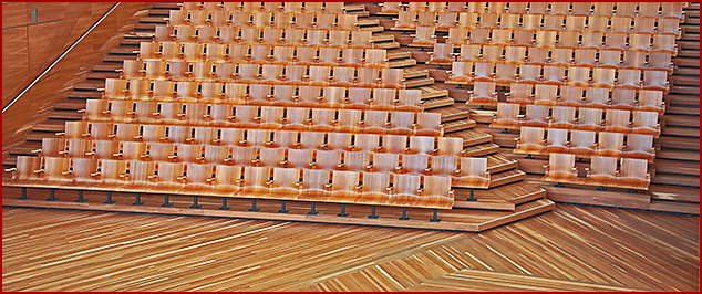
Nice. Patterns everywhere and very nicely captured |
|
 Photographer found comment helpful. Photographer found comment helpful. |
|
|
01/02/2006 09:48:38 PM |
|
You got several good patterns in this. The color and lighting are good. I might have chosen one of the patterns and concentrated on it. In this the great diagonal of the chairs and steps would have worked very well on its own. |
|
| Photographer found comment helpful. |
|
|
01/01/2006 11:57:53 PM |
|
great example of a pattern, but I don't understand the cropping. I feel like I want to pan upwards to see more. |
|
| Photographer found comment helpful. |
|
|
01/01/2006 09:50:44 PM |
|
captivating composition, colors, tones and textures-- i like it |
|
| Photographer found comment helpful. |
|
|
12/30/2005 08:02:04 PM |
|
nice pattern, could be nicer with a focal point at the bottom of the diagonal stairway. needs some dark contrast IMO. |
|
| Photographer found comment helpful. |
|
|
12/29/2005 08:29:44 AM |
|
Yellowish tint of the photo makes it look like an old snapshot. Composition seems lacking to me. mabye you should have brought the bottom edge of the first row all the way down to the bottom of the image? Not sure but it just doesn't sit right with me. |
|
| Photographer found comment helpful. |
|
|
12/28/2005 07:52:55 PM |
|
| Photographer found comment helpful. |
|
|
12/28/2005 11:35:06 AM |
|
Please post a location for this after voting. I'd love to know where this is. Great pic. 9 |
|
| Photographer found comment helpful. |
Home -
Challenges -
Community -
League -
Photos -
Cameras -
Lenses -
Learn -
Help -
Terms of Use -
Privacy -
Top ^
DPChallenge, and website content and design, Copyright © 2001-2026 Challenging Technologies, LLC.
All digital photo copyrights belong to the photographers and may not be used without permission.
Current Server Time: 06/29/2026 07:05:40 AM EDT.