| Author | Thread |
|
|
01/05/2006 12:28:31 PM |
|
Congratulations on your top 10 win. |
|
|
|
01/04/2006 02:19:48 AM |
|
Elegant--the yellow adds to the feeling of timelessness I get from this setup. |
|
|
|
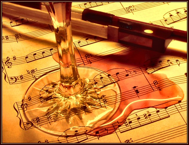
01/04/2006 01:27:55 AM |
|
Congratulations on your top 10 with this melodious spill. |
|
Comments Made During the Challenge  |
|
|
01/03/2006 04:40:07 PM |
|
Nice setup, good positioning and romantic colours! Good light and a real Oops!. |
|
|
|
01/03/2006 08:13:23 AM |
|
Terrific; printable. Chaotic and moving; aged perfectly by the yellow tones; perhaps go with a shiraz or cabernet on the music for a deeper, redder blood type look. |
|
 Photographer found comment helpful. Photographer found comment helpful. |
|
|
01/03/2006 02:15:55 AM |
|
| Photographer found comment helpful. |
|
|
01/03/2006 01:58:26 AM |
|
beautiful color and detail. too bad you had to ruin your notes. 8. |
|
|
|
01/02/2006 11:34:08 PM |
|
|
|
01/02/2006 07:30:01 PM |
|
Definitely an "oops." Well composed (no pun intended). If it were a bit sharper/crsiper overall I would have scored it another point higher. |
|
|
|
12/31/2005 11:36:13 PM |
|
I love this one. and what i would usually take points off for (the brown tone of incandescent's not adjusted) I actually like it here... gives it a homie feel 9 |
|
| Photographer found comment helpful. |
|
|
12/31/2005 06:46:27 PM |
|
I really like the color composition. |
|
|
|
12/31/2005 01:18:13 AM |
|
Beautiful "composition" and color. Perhaps a touch more DOF, saturation, and whiter levels would help, but this should do well anyway. |
|
| Photographer found comment helpful. |
|
|
12/30/2005 03:16:36 PM |
|
very nice composition, one of my favorites in the challenge - good idea, I'm not sure if I like the yellow tone, and I know that it's basic editing but I'd be curious to see this in B&W with selective coloring to the red wine only - that would be neat - nice work :) |
|
| Photographer found comment helpful. |
|
|
12/30/2005 02:10:30 PM |
|
The idea isn't bad but the yellowish hue of the picture turns me off and the shot looks a little too forced. |
|
|
|
12/30/2005 09:28:54 AM |
|
Where did the spill come from? Or did it sloosh out of the glass? Seems to setup for me. Nice lighting though. |
|
|
|
12/29/2005 06:44:43 PM |
Nice composition! Really sells the thought! I'm a musician, too. I understand the duble entendre as well as the Oops concept. However, I think this qualifies as great thought put into great photographic art.
You have succeeded!!! |
|
| Photographer found comment helpful. |
|
|
12/29/2005 04:00:46 PM |
|
|
|
12/29/2005 10:02:28 AM |
|
A wonderful concept. The thing that bothers me is the yellow cast from the light |
|
|
|
12/29/2005 12:08:28 AM |
|
|
|
12/28/2005 10:52:46 PM |
|
One of the best images in this challenge, so, so, good............. deserves a ribbon. |
|
|
|
12/28/2005 02:30:16 PM |
|
very impressive picture! -9- |
|
|
|
12/28/2005 12:29:15 PM |
|
|
|
12/28/2005 11:10:04 AM |
|
Thats not violin sheet music! Beautiful photo, good work. |
|
|
|
12/28/2005 09:32:37 AM |
|
|
|
12/28/2005 09:08:27 AM |
|
The lighting here seems to be orange. I believe a white light, or a white balance, might make the fluid colors stand out better and give a better impact. Like the concept though |
|
|
|
12/28/2005 08:14:45 AM |
|
I like the hues, but wonder if leaving the bow out wouldn't have helped. |
|
Home -
Challenges -
Community -
League -
Photos -
Cameras -
Lenses -
Learn -
Help -
Terms of Use -
Privacy -
Top ^
DPChallenge, and website content and design, Copyright © 2001-2026 Challenging Technologies, LLC.
All digital photo copyrights belong to the photographers and may not be used without permission.
Current Server Time: 06/29/2026 06:58:15 PM EDT.