I think this is the first time I have ever drawn a last place image to critique. Here's my first impression of your photograph... You don't seem to care much about it yourself. You didn't post any of your own comments in the 'photographer's comments' box when you posted the image. This indicates to me that you either don't care much about it or that you just may possibly be addicted to the update button and had to submit something to the challenge.
You should always use the maximum number of pixels available for the challenge entry (640 on the long side). When you post smaller images like this one, you will usually get comments to that effect and lower scores. Detail is harder to see in small photos.
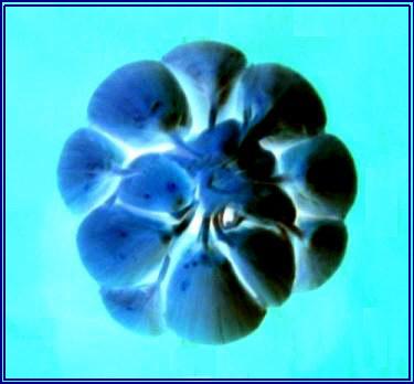
This photo appears to be out of focus. The subject doens't hold much interest for me. I'm assuming that you probably felt the same way about it since you chose to apply a filter to it to create the majority of the image impact. This usually doesn't do well either unless the challenge calls for it.
I'd like to see what this would look like a bit larger (using the max. 640 pixels allowed) and also a bit sharper. I do like the lighting and blue tones though.
Sorry but the cheap invert photoshop trick isn´t hitting the spot at all with me, frankly I strongly dislike it. Just thought I owed you an explanation why I gave it a 3 wich is the lowest I give if I think a shot meets the challenge.
Interesting. For some reason, though, I found the background color choice to give conflicting sense to the image. I like the blue cloves, but I don't get a nice harmonious sense to the picture.
Garlic is so boring to shoot for me. I am glad you turned it into a negative and did something a bit creative with it. I give you points for that creativity, but it isn't all the appealing either way to me.






 Add photograph to your favorites
 Add photographer to your favorites


