| Author | Thread |
Comments Made During the Challenge  |
|
|
12/31/2005 11:57:15 PM |
|
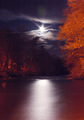
Nice shot, it may have worked better to do this in manual mode and decrease the amount of light either by using a faster shutter speed or decreasing the aperture. |
|
|
|
12/31/2005 10:41:04 PM |
|
The blackness of the bottom of your photo keeps "dragging" my eyes downward and away from the top part of your photo which I find to be the most interesting. |
|
|
|
12/31/2005 01:04:05 PM |
|
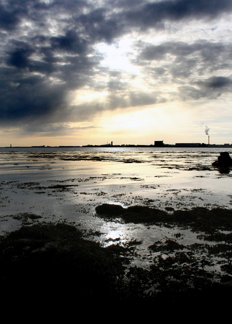
Quite a dramatic sky with great radial release. The foreground helps carry the eye into the unknown. Bumping up. |
|
|
|
12/30/2005 09:08:11 PM |
|
Could this be a case of monitor-calibration-differences-lower-score? On my monitor the foreground is very dark, too dark to make out any detail while the sky is so light that i cant see the "jesus light" very well. Could be my monitor, I'll recheck from work before my final vote. But darker images often suffer here because of peoples monitors. Also you have some great leading lines, the line of rocks, the bamk of clouds, and the bit of land with the lighthouse (?). Unfortunately all your lines lead the viewer out of the frame to the left and nothing leads me back into the image. Once a DPC voters eyes are led out of an image his mind thinkd "Done, next image". Anything that brings the interest back into the picture and makes him look longer increases his chance of appreciating what you were trying to convey. Thirdly, your image is divided exactly in the center sky, vs sea by the line of land. What if you had divided it onto thirds instead. Then either the sky or the ocean rocks would get more emphasis and they wouldnt compete for attention. just suggestions, and so you dont think Im just complaining i'll tell you that I like the image and am giving it a 7 |
|
|
|
12/30/2005 06:51:51 PM |
|
This i too nice picture!!!!!!!!!!!! |
|
|
|
12/29/2005 10:33:49 PM |
|
|
|
12/27/2005 08:57:05 PM |
|
Amazing lighting! Good work. |
|
|
|
12/27/2005 07:18:29 PM |
|
Luv the soft silvery colors, and the stillness is perfect..................... |
|
|
|
12/27/2005 06:26:09 PM |
|
Would have also qualified for "muckpond" as well. :-) Unfortunately, the "island" concept does not come across that strongly in this image. |
|
|
|
12/26/2005 06:59:20 PM |
|
Hmmm, might have gone better for "muckpond". Not really seeing "island" here, but the sky is pretty! |
|
|
|
12/26/2005 05:33:22 PM |
|
There is no username called IslandView |
|
|
|
12/26/2005 12:48:02 AM |
|
Home -
Challenges -
Community -
League -
Photos -
Cameras -
Lenses -
Learn -
Help -
Terms of Use -
Privacy -
Top ^
DPChallenge, and website content and design, Copyright © 2001-2026 Challenging Technologies, LLC.
All digital photo copyrights belong to the photographers and may not be used without permission.
Current Server Time: 06/29/2026 07:27:11 PM EDT.