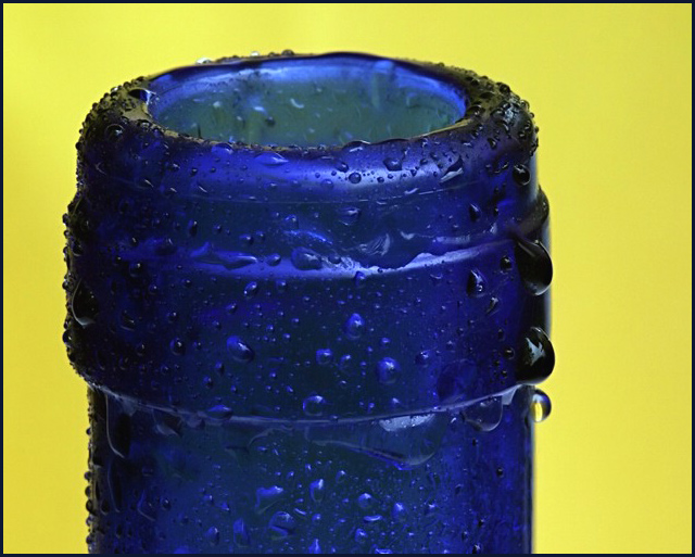
The colours work really well together, the added condensation is a nice effect (compared to a plain bottle neck)... givent the relative size of the bottle compared to the whole frame I think it would have looked better more centred.
Great focus and detail. I also like the contrast between the blue and yellow. I think it needs to be cropped just a touch more on the right, as it feels a bit unbalanced to me, or give it more "space" around the right and top. Right now, it is just barely off of center, adn it makes it look "accidental," I think.
Good color and contrast, excellent sharpness and great texture on the water drops. But I'm wondering about the composition. It's too off-center to be considered centerd and not off center enough to be off-center. It just doesn't look right to me...
Some delicious colours and textures here, but a strange composition... I'd have prefered more white space to the right. Beautifully lit, great saturation. Dof is spot-on. With more effective use of cropping and white space, this could have got a 10. Instead: 8





 Add photograph to your favorites
 Add photographer to your favorites


 Photographer found comment helpful.


