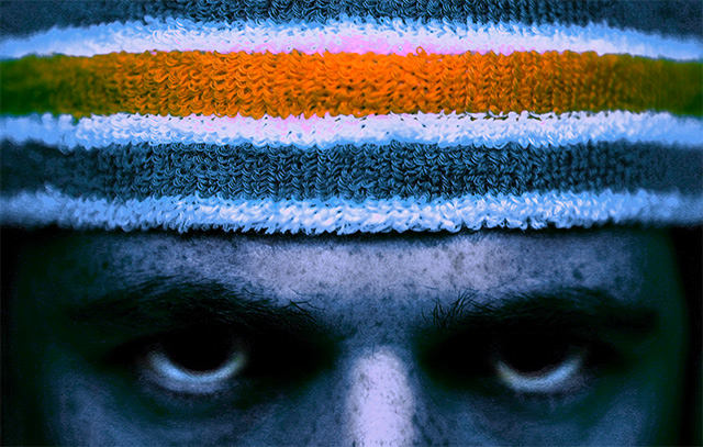
I put this photo up in the forums to get people's opinions, so some people will know it's mine. I took most people's advice and straightened the image and dodged the eyes so they would stand out more. I hope the people like the changes I made and I hope people who have never seen it like it too.
Statistics
Place: 414 out of 519 Avg (all users): 4.9263 Avg (commenters): 5.0526 Avg (participants): 4.8048 Avg (non-participants): 5.2667 Views since voting: 722 Views during voting: 419 Votes: 285 Comments: 21 Favorites: 0
you might consider not posting in a forum something that may go into a challenge. It's like I had a preview of yours and not others. That said....hmmmm....well the composition is interesting but the grunge thing I think you said your were going for doesn't work for me in this. Any portrait I think should have good details of the eyes. This comes off more abstract because of the lack of the definition in the eyes. But...it is different.
This may veer from the taste of many of the voters here, but I find it an interesting photo. I wish there was just a little bit more descernible detail in the eyes area, just a little, not enough to change the 'feel'.
This is very interesting and quite artful. I like the graininess of the eyes. The horizontal stripes with the single orange amidst all of the blue and white is impactful. I like this alot.
Hmm, this one has been already analyzed in the forums. And not in a pretty way. For some reason, not only it is no longer anonymous, but you've received comments on the improvement already from other members, including Joey's advice on applying grunge dodging & burning....
Still, I'll vote as if I haven't seen this one before as no rules were broken: too dark for my taste. Nice touch on the eyes. Slightly (or apperas to be) blown white stripes in the headband - cast into pinkish shade. Nose could have been burned a bit to reduce the glare.






 Add photograph to your favorites
 Add photographer to your favorites


