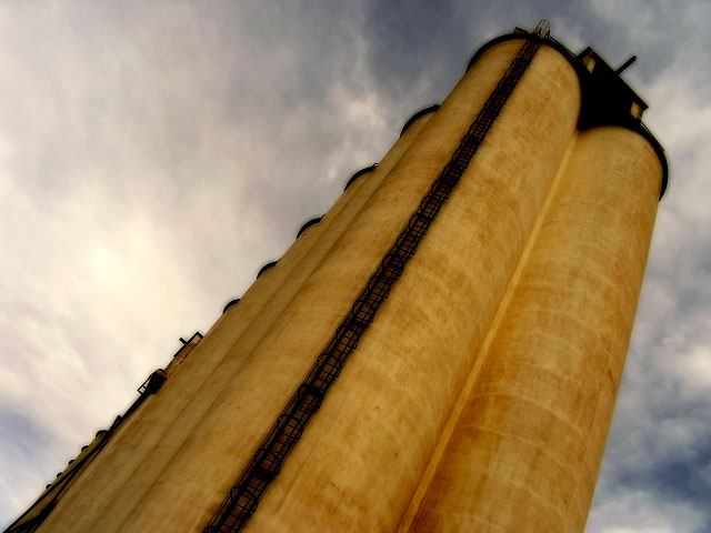
I think this had real potential. I like the composition and colors. It looks like it got killed in post-processing. Did you use Neat Image? Looks a bit "plastic". I assume that's what's causing the halo effect around the grainary since this was a basic editing challenge. That's the only big minus in this picture. Like I said, I like the vertiginous composition and the contrast between the reds and blues...
I didn't look at the other comments yet, but I bet you already knew all this... ;)
the sky is nice but since the focus should be on the industrial part of the photo, perhaps a more focused photo? or maybe it IS focused, but it really feels blurry to me, liek your main object is not really your main object and basically its disturbing. but the sky is nice.
7 - Like this and the colors together. Criticism; don't know how you did this under 'basic', but seems like it is 'over' burned. A more subtle 'burn effect', would have made this better in my opinion. Too much detail is lost in the concrete(?) structure/silos/tanks/whatever. Good angle/perspective. Just those black areas seem too 'processed' to me, hard to explain. edit:typo






 Add photograph to your favorites
 Add photographer to your favorites

 Photographer found comment helpful.


