Greetings from the Critique Club! :)
Composition
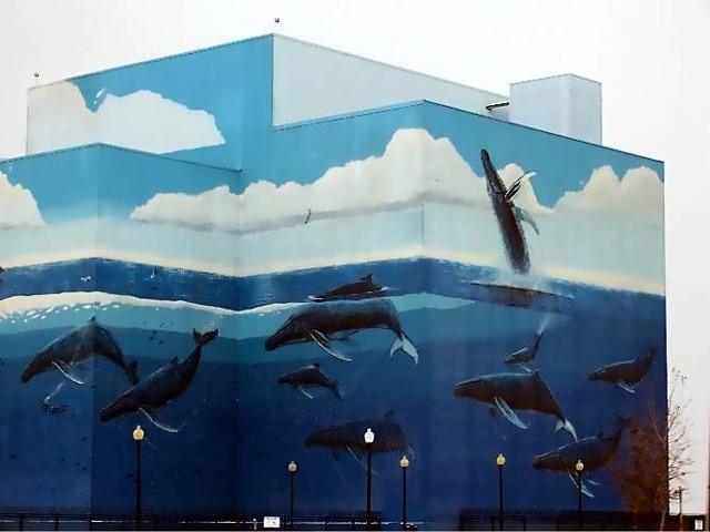
While I understand the difficulties of shooting at 60 MPH, this shot is really weakened by the fact that the building doesn't "do" the same thing on both sides of the image. If it were either cut off on both sides, or had a blank space on both sides, I think the image would be more powerful. I would speculate that a small amount of space on both sides would be best. Perhaps this was an intentional crop, but I suspect you were victim of a "drive by shot". :)
Background
I'm really impressed at the fact that the sky is a very consistent white without appearing blown out. It almost makes this look like a studio shot in front of a sheet of muslin or something. Your exposure was very accurate in this regard.
Camera Work
It's difficult to really do much camera work in a "drive by", but the exposure is very good in general. The building paint scheme is very unfamiliar to me, so I can't analyze whether you were able to record the details or not. Some of the shadows seems a bit dark, and the entire picture seems just a bit noisy. If that's just your camera and not the fault of anything you have done, I understand. It is also possible that the car window caused some difficulties.
Post Processing
This seems to be minimally processed, but you have done a good job of setting levels and managing your colors.
My Opinions and Impressions
This is a shot with a lot of potential, and you've done well with what you were given. Given the opportunity to approach the building with a tripod, I'm sure you would make a very impressive image. Good shot!
Thanks for submitting: feel free to PM me if you have any questions about this critique.
nards656 |