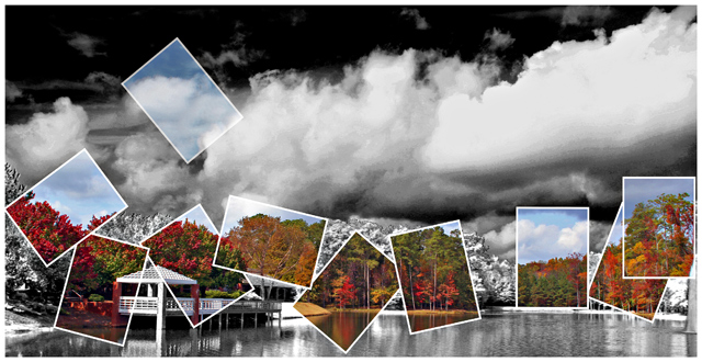
Excellent idea and execution. Except for the rhythm in the placement of frames. I think there could have been better music in that and an offbeat blue-note. Hard to explain.
Great idea and I think it works well with your chosen subject. Your B/W version looks a tad overprocessed in the sky/clouds, but I love the contrasting colors.
I love it! This is why DPC is one of the greatest places on the web. I just love the effects, and although it has been seen before, it serves as a great reminder on how to make good photos stand out even more!
looks like a hp commercial! Neet effect, there is a couple of clouds that look funny but it may be my monitor. It is busy, but I don't feel that it is a bad to busy sometimes....be creative and do what you want.
I think it's a good idea however you may have too many small coloured areas and the angles you have them at don't seem to flow very well. Making them bigger and having fewer of them may help.




 Add photograph to your favorites
 Add photographer to your favorites

 Photographer found comment helpful.


