Hello from the Critique Club!
I have studied your image and have the following to offer:
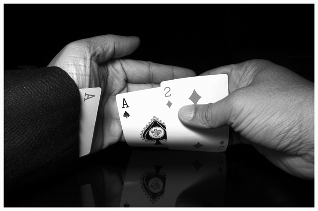
Composition/perspective - one of the stronger aspects of this image is the closeness to the subject. Gives you the feeling they are your (the viewer's) cards. The focus is spot on and the DoF is excellent - the front of the hands and sleeves is just as sharp as the back of the thumb - the farthest part of the image. The flat black background with the table surface being reflective is a nice contrast. The border is ok, but not necessary. It doesn't add or detract from the strength of the image. The detail here is nice as well. The textures in the weave of the sleeve, the wrinkles in the skin, etc. are a nice contrast to the smoothness of the table surface and empty background. The ratio of subject to negative space is well done here as well. Technically a good image, but lacks some sort of 'pop.'
Color - b/w, the range from black to white is populated nicely by a strong range of grays. As a suggestion, the ace in the sleeve may have looked nice as the only color element. Would have drawn more attention to it and added an element of distinction.
Lighting - very well done. there are no flares, glares or bright/overly dark areas. Just the right amount to give a nice reflection without being overbearing. The detail is not washed out or hidden by dark shadows (the hands, particularly the bottom of the right hand.) The 2 and ace in the hand come off a little bright near the top center of the cards, but no detail is lost and the edges of the numbers are clear and undistorted.
Challenge requirements - this may be where this fell short a bit. The image itself meets the challenge requirements quite well. However, due to the abundance of this type of image in the challenge may have weighed on the voters.
Overall/my opinion - technically this is an excellent photo. Black and white was a good choice for the processing as it allows the textures to really show through. as stated above, I think the only place this fell short was the subject matter.
EDIT: typos
Message edited by author 2005-11-30 09:49:07. |