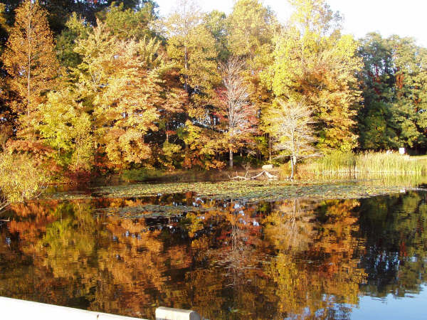
I like the composition. What I do not like is the railing exposed on the bottom and the fact that the reflection of the sky in the water is blue yet the non reflection appears to be washed out. Not sure how that can be resolved using basic.
This is lovely but I would have cropped out the bottom left corner thing as it is a distraction to the otherwise lovely colors. Also, the sky in the water is perfect. Too bad the real sky isn't the same color.
Good reflection, but no real bright colours to stand out and grab your attention, you know? Perhaps this shot taken a couple of weeks earlier, when the leaves are in prime colour? The trees also appear to either be oversharpened/grainy, or out of focus.
nice title, the reflection in this image is very good, the colors seem a little drab to me (just my taste) perhaps they could have been brightened a little bit more in editing and I would have cropped the bottom off - perhaps this is straight out of the camera though and it does meet the challenge :)
I know it's hard (sometimes impossible) to retain the sky, but maybe a little underexposure would have helped both the sky and the midtones in the leaves.







 Add photograph to your favorites
 Add photographer to your favorites


