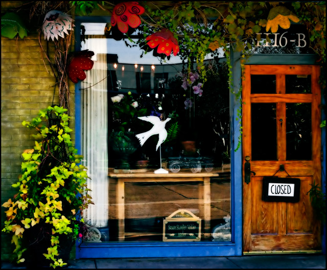
A bit too busy for my eyes. Framing of subjects is good, but there is just too much going on there. Colors are good, could use a bit more sharpening. Can't see how the mask feature comes into play, wish you had said more about that as I am curious.
Looks like a nice small town kind of shop. The colors are bright...I wonder if this is one of those images where the ever so popular Neat Image was used? I like the composition. 7
Hmm, I think the neat image didn't really help here. It's neat on the door, but I don't like it on the window. It makes the dove look OOF. A cute shot though. 6
To me, this looks a liittle cluttered. For some reason, there seems to be a little too much pavement at the bottom of the frame for my liking. Good, strong colours, without seeming oversaturated.
this is so colorful! I really like it. The only thing I would change is to straighted the image...looks a little crooked but that may be the angle of the street.






 Add photograph to your favorites
 Add photographer to your favorites


 Photographer found comment helpful.


