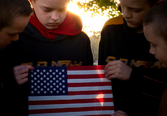
This shot impressed me. The lighting, the focus of the kids on the flag and the fact that the flag is a small version of something that is awefully big. The camera work was good but I liked the compostion and the story it offers even better.
2nd look - good idea...but,
too bad about the flare, fill flash would have helped
the sweatshirt logos really a detracting element for me, I want to read them but can't.
I voted 4. The concept is really good and I can see how the holding of the flag portrays pride. Backlighting is a great idea, however it hasn't worked as well as it might have in this particular shot. The sun's glare at the side of the boy's head is too much and the eye is led to it and away from the rest of the image. Perhaps some "in-fill" light to the foreground might also help a little? Best of luck though in the challenge and I hope my comments have helped - even if just a bit. I confess that I've still lots to learn myself and can only comment within my own limitations.
I like this concept of pride. Nicely setup. The setting sun is a nice touch, especially in the area on the flag. I guess the only thing I would have like to have seen would be a bit more light in the foreground around the boys' faces.
I struggle with the composition of this picture. Do I look at the flag or the flare? I think it's okay to have two points of interest, but I don't think it works in this picture. Sorry I can't be more specific.







 Add photograph to your favorites
 Add photographer to your favorites


 Photographer found comment helpful.


