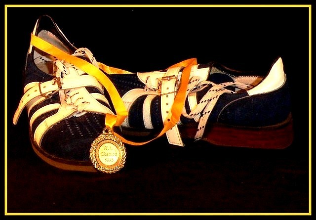
The negative space is good. The placement of the shoes is as if you just took them off, threw the ribbon on the ground and went to grab a Gator Aid. The lighting off of the medal is a bit harsh. I think the yellow of the frame, although it ties into the other coloration, is a bit too much. Maybe a creamy off white like the stripe of the shoe would have worked better. The focus doesn't seem quite as tack sharp as I'd like to see. 6
I really like this image, and the boder works for me. I know most don't seem to like them. wish for the highlight on the medal to not have remove most of what I assume is the P on champs. Probably looks fine at a larger size? good stuff.






 Add photograph to your favorites
 Add photographer to your favorites


 Photographer found comment helpful.


