I am having difficulty with this image representing celebration.
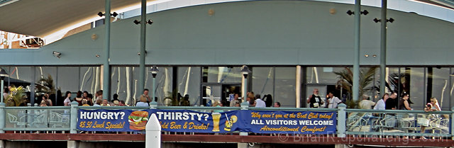
The wide perspective crop on this is fine, but the way the curved roofline come in & out of the picture is distracting. It appears this was a small part of an original image due to the lack of detail, unless a bit too much noise reduction was used. (4)
For me, the main focus of this photo is the large banner, which unfortunately is blocked partially by the white cylindrical object in the foreground - which is distracting to me. I wonder how this would have been if you were closer to some of the people feasting? Also, be sure to try and utilize the maximum or as close to the alotted 640 pixels as stated in the challenge rules. Larger photos can sometimes have a better impact on voters :)
i think this shot could have done better if we could see the 'celebration' more clearly, rather than inferring it from the title. since the major elements are structural, the uneven lines are a bit distracting. a closer shot, straight-on shot might have had more impact. good luck in the challenge!
This image IMHO is blah! There's really nothing to peak the interest here. I gave you a 4 simply due to the fact that this just looks like it's just a snapshot as you were passing by. I don't mean to sound mean but evaluate your image again and ask yourself, \"What is the celebration in this image?\".
while this shot does show lots of people, the focus becomes the architecture/banner because that's the only thing you can see clearly. it results in a not very interesting photo, imo. i would be interested in seeing tighter shots of the people enjoying that feast.
I'm not sure what the focus of this image is. I'm guessing its the sign, but the composition really doesn't emphasize it, especially with the pole in front. Keep trying, improvement will come.





 Add photograph to your favorites
 Add photographer to your favorites


 Photographer found comment helpful.


