| Author | Thread |
Comments Made During the Challenge  |
|
|
10/11/2005 05:49:39 PM |
|
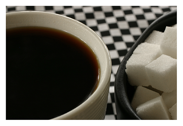
good contrast, color and detail, but this doesn't feel very balanced I guess. |
|
 Photographer found comment helpful. Photographer found comment helpful. |
|
|
10/11/2005 02:42:53 PM |
|
| Photographer found comment helpful. |
|
|
10/07/2005 09:09:54 PM |
|
Nice, composition looks a little tight though. |
|
| Photographer found comment helpful. |
|
|
10/07/2005 04:33:18 AM |
|
would have been nice if the cup and the bowl were equal size. |
|
| Photographer found comment helpful. |
|
|
10/06/2005 01:00:01 PM |
|
This would have looked better as a B&W - IMO. It needs to POP. I love the cube and checkers connection. I just feel the white is not white enough. 9 |
|
| Photographer found comment helpful. |
|
|
10/06/2005 01:16:18 AM |
|
| Photographer found comment helpful. |
|
|
10/05/2005 11:35:08 PM |
|
i like the pairing of the sugar cubes and the squares in the background. i also like the reversal of colors in the sugar cup and coffee cup. there's something about the composition, though, that feels a hair off. wish i could articulate that better...maybe it's the proportion of cups displayed in the shot? |
|
| Photographer found comment helpful. |
|
|
10/05/2005 10:54:35 PM |
|
I think a "half-and-half" (no pun intended) composition might have proved more interesting (i.e., having had each subject take an equal amount of space). |
|
| Photographer found comment helpful. |
|
|
10/05/2005 09:44:53 PM |
|
Very nice. Crisp and clean and well composed. 10 |
|
| Photographer found comment helpful. |
|
|
10/05/2005 08:54:15 PM |
|
White border makes the sugar cubes look grey-yellow, and that bothers me. Like otherwise. |
|
| Photographer found comment helpful. |
|
|
10/05/2005 03:59:22 PM |
|
Great job...not only is the shot spot on in focus, but the design on the table makes it a stand out. |
|
| Photographer found comment helpful. |
|
|
10/05/2005 08:35:56 AM |
|
Detail of sugar is really good. The use of black and white checks to mimic the b&w cup and bowl was very creative. The squares match the sugar cubes nicely. Felt it took away from the coffee, though. Still, I understood where you were going with it, but I think you might have enhanced the wrong subject with your composition. |
|
| Photographer found comment helpful. |
Home -
Challenges -
Community -
League -
Photos -
Cameras -
Lenses -
Learn -
Help -
Terms of Use -
Privacy -
Top ^
DPChallenge, and website content and design, Copyright © 2001-2026 Challenging Technologies, LLC.
All digital photo copyrights belong to the photographers and may not be used without permission.
Current Server Time: 06/29/2026 12:13:18 AM EDT.