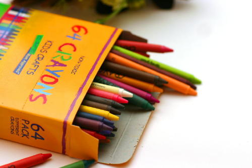
Too many colours here to show complementary colour contrast. You could have separated out your red toned crayons, for example and your green toned crayons and shot against a white background for a better demonstration of the complementary pair.
A colorful photo. Is it a good example of complementary colors? I don't think so. The orange and green crayons in the foreground could have helped satisfy the challenge topic if they were more present in the picture, perhaps. The objects and the top distract, the white to the right seems unnecessary--perhaps cropping in a bit more would have improved this composition.
Obviously since every color is here there are complementary, but I think you should have set up the shot so that complementaries were obvious. I also think the crayons should be in focus.







 Add photograph to your favorites
 Add photographer to your favorites


 Photographer found comment helpful.


