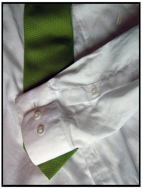
I took this as a last min. shon in my "studio" (aka my messy room) did some color ajusting in ps and also a Gaussian blur then crop and resize to fit on the site.
Statistics
Place: 279 out of 318 Avg (all users): 4.1345 Avg (commenters): 2.2308 Avg (participants): 3.4649 Avg (non-participants): 4.7500 Views since voting: 940 Views during voting: 299 Votes: 238 Comments: 15 Favorites: 1 (view)
Complementary colours are pairs of colours that contrast strongly when compared to each other. In this photo, the predominant colour is the green of the tie, but there is no complementary red to set it off.
Black and white are neutrals and not colours at all, and therefore they cannot be complementary colours... white shows the presence of light, and black shows the absence of light.
Black and white areas next to each other do demonstrate high contrast, but high contrast gives a different visual effect than complementary colours do in a picture.
Your image demonstrates a duotone effect rather than the effect of complementary colours.
Check some of the forum discussions on complementary colours for suggestions on using colour for contrast.
This is an interesting composition, but it doesn't show any complementary colors. I do like the lightng - it brings out the texture of the shirt and tie.
i like it man, u did a good job with this 1, your boarder is alittle wacky it is thinner on tlong sides (virt.) and thinker on the short sides (horiz.)...but hey what can u do...at least that is the only problem that i see with it.
oh and there is some color noise or color problems in the shadow of the sleve...try more than 1 or to light scorces next time....also glad to see u'r not having the downsizing problems...
(next time iron the shirt)






 Add photograph to your favorites
 Add photographer to your favorites


 Photographer found comment helpful.


